Growth is a process with many small pieces. You have to make the right decisions consistently in order to reach your goals. This is the case for both the Apple App Store and the Google Play Store. Sometimes you might get the feeling that people are getting caught up in tiny details that actually do not matter. However, this is not the case. In mobile app marketing, the difference between growth and failure can be a very thin line.
According to Forbes, there are now 8.9 million mobile apps. This means an incredible amount of competition in the marketplace. So standing out from the crowd in the Apple App Store or Google Play Store is no easy task. You have to do intensive research and planning.
Before anything else, if a user does not know your app exists they can not download it. No matter how good it is. So you have to become visible to your potential user base. Meaning that you should appear to a user when they do an app store search. Two main ways to achieve this is through App Store Optimization and advertising strategies. You can use tools such as Mobile Action’s ASO Intelligence or Ad Intelligence to optimize your growth strategies in a data-driven way.
Today, we will focus on something else instead. Let’s discuss how you can wrap your app in a pretty package in order to charm people into downloading it. As it is with romantic relationships, the first couple of seconds is what matters when it comes to converting users. By using the right kind of imagery coupled with effective texts, you can increase your chances of being installed.
Let’s take a look at some of the things you can do to increase your mobile app installs.
Creative Ads
As you can see, “Creative Assets” is in the title of this post. Thus it would be rude for us to not mention the creatives that are used for advertisements. There are so many variables that come into play when constructing your creatives that it can be overwhelming. Your target audience and their preferences, the overall trend in the category, specifications of your app, and even more…
The first thing to remember that the app market is a very dynamic environment. Habits, trends, and preferences change in the blink of an eye. So a creative that is performing incredibly well one day can be worthless in a short amount of time. This is why you have to be researching and optimizing your efforts continuously to make sure that your efforts do not get wasted.
While creating your ads, you can not just simply trust your instincts. Research is key. You need to examine your variables and try to figure out how to optimize your creatives in a way that will maximize efficiency. If you want to learn more, you can watch our webinar on how to build a data-driven creative framework.
Perhaps the best way to start doing your research is by looking at what your competitors are doing. For example in the hyper-casual game category, playable creatives are used very commonly. By introducing their UX to potential users, they try to extend their user base.
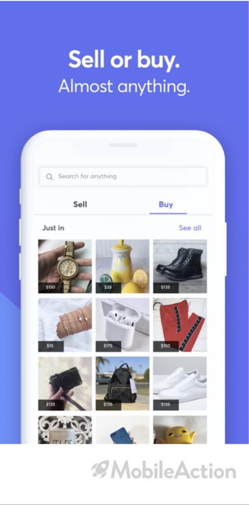
On the other hand, shopping apps prefer images as creatives where they differentiate themselves from competitors. These are just two very obvious examples.
It is hard to even imagine what kind of patterns successful UA managers have discovered. Through our Ad Intelligence, you can always keep up with these ever-changing trends and make sure that you are up to date with the market. Also, with our subscription-based solution, you can get notified when your competitors release new creatives.
Localization and A/B Testing
Localization is a key aspect of advertising. If you create an ad for the United States, it is not reasonable to expect for that creative to perform well in China. This is why you have to consider the audience demographic when creating your strategy. Let us take a look at Bigo Live’s creatives to illustrate our point. For those that don’t know, Bigo Live is an app that uses an extremely aggressive app marketing strategy. You can check our ad analysis on Bigo Live to get a better understanding of their tactics
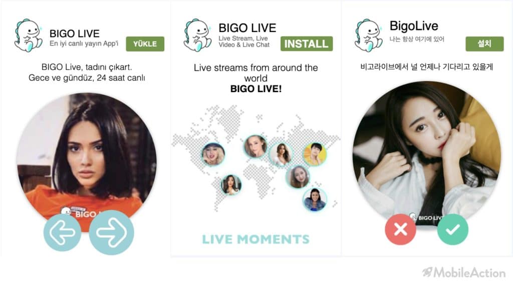
As you can see above, Bigo Live has tried to localize its creatives. They did not only translate their text but also used different images that reflect people in their respective countries. Even finance professionals tend to over-invest in their own countries, something called the “Home Bias”. If we apply this to the app world, we can assume that if we make people feel like our app belongs to their country, it can increase the efficiency of our ads.
Clearly, there are lots of things to consider when creating ads. This is why you need to conduct A/B tests. Aggressive UA managers continuously release and remove creatives from circulation. They do not rely on intuition to decide which creative strategy is working and which is not. They engage in A/B testing to determine what kind of creatives are performing better.
A/B test can also be further specified. For example, one creative might be bringing impressions from mostly young people while it does not attract older demographics. Or a creative might be more effective on the female audience compared to males.
To make a long story short, you have to keep experimenting with different creatives and conduct A/B tests to optimize your app promotion. This way you can reduce costs while increasing revenue.
App Logo
Congratulations. Through ASO or advertising, you managed to get a user to view your Apple App Store/Google Play Store listing. They are staring at your app page now. What is the first thing that catches their eye? Most probably your app logo. So you better make it count.
App logos are one of the first things your potential users see. According to the notion of “First Impression Bias”, people seem to place an unreasonable amount of weight on their early experiences with regard to a person (or in our case, an app). This is a cognitive flaw that needs to be considered in your plans. Even if you have the best screenshots, descriptions, and previews, if the user dislikes your logo, you reduce your chances of being installed.
Some simple adjustments can make your logo more likable:
- First of all, decide on your color. Rather than pale colors, a bright and attention capturing choice of color might be more helpful.
- Keep it simple. Do not overcrowd your logo. It is already a very tiny space, so you should not trade clarity for complexity. One way to do this is to avoid using too much text.
- Another important point is to differentiate. Your logo should stand out from competing logos. Your app should be instantly recognizable from its logo.
- A/B testing is critical for measuring the effectiveness of your logo design. Do not hesitate to experiment and optimize.
Screenshots
Screenshots take up most of the space in your app listing. Now that you made a good impression with your logo, it’s time to close the deal. Before starting on your design, you should be aware of the technical specifications of your market. For example, Apple App Store allows up to 10 screenshots while this number is 8 for the Google Play Store. There are also image size specifications according to the device. These numbers can always change, so make sure to do your research.
Starting with orientation, it is recommended to use vertical screenshots unless your user interface is horizontal. Do not forget that the first few screenshots are the most critical. Most probably users will not even view the rest of the screenshots. Thus in the first few screenshots, you should be able to convert the user. Another tip is to create a flow through your screenshots. This can be created by splitting images or by a logical flow that represents the user experience.
When it comes to the images themselves, a few considerations should be made. You should clearly emphasize your selling points in your screenshots. Most likely there are many apps with similar functions to yours. Why is yours better? Why should I prefer your app over the other ones? These unique selling points should be displayed in the first screenshots.
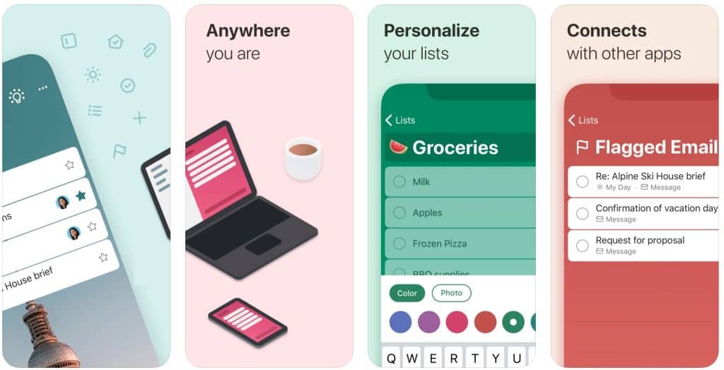
Microsoft To Do’s screenshots can provide a good example. As you can see, it has soft and attractive colors, a very minimalistic look and clearly stated selling points.
You can also use Call-to-Action to engage with your potential users. Using direct phrases such as “Download”, “Install”, “Join Now”, can be helpful for conversion. Finally, as with the logo, you should focus on clarity and readability. Overcrowding your images will not be helpful.
When you have finished creating your screenshots, you can subject them to A/B tests as well. This way you can differentiate well-performing creatives from inefficient ones and optimize.
How Can Mobile Action Help?
Creative assets are fundamental to any growth strategy. From ads to screenshots to your logo, you should adjust every small detail for your goals. Creating a good impression on the user is critical for increasing your installs. While optimizing your creative assets,you should also keep app store differences in mind. Google Play Store app creatives might require different specifications compared to Apple App Store apps. This should also be a major consideration for your plans.
By using mobile Ad Intelligence tools, you can conduct extensive research to reach data-driven insights in order to boost your growth. Schedule a demo with us today and let us show you the power of Intelligence!