


This handbook will serve as your roadmap, packed with emerging trends, valuable insights, and the best ASO tools & resources. It aims to help you stay ahead of the competition and enhance your app marketing strategy for substantial growth in 2025 and beyond.
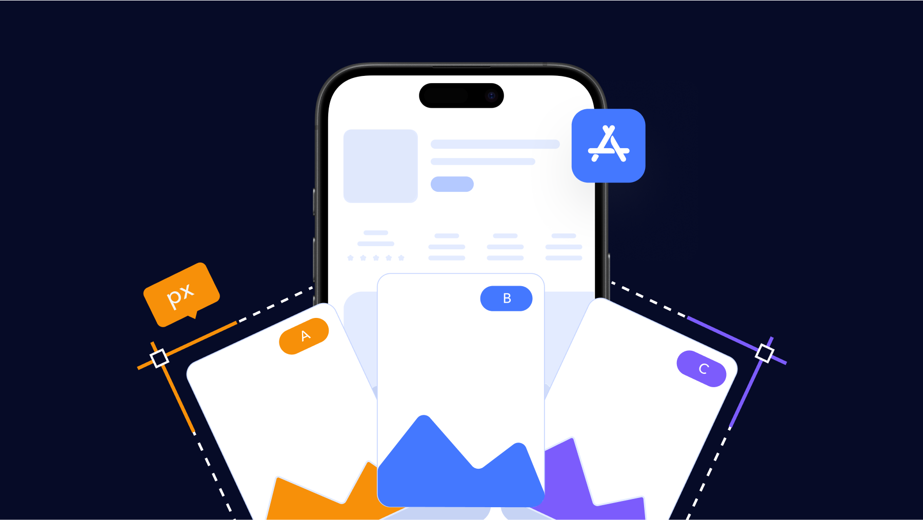
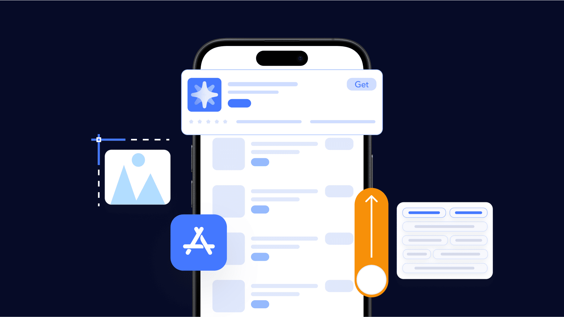
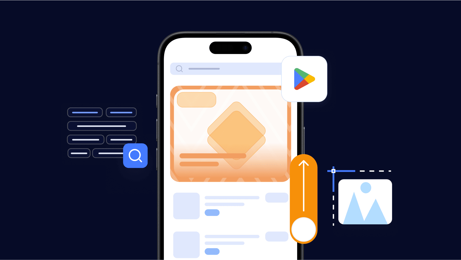
App screenshots are one of the most important assets for app marketplaces like the Google Play Store.
They provide users with a glimpse of your app’s key features and value proposition before deciding to download.
With billions of apps available on the Play Store, you need to make your screenshots stand out and encourage discovery.
However, as mobile technologies advance, screenshot sizes and design guidelines are always evolving. What worked last year may not work as effectively in the current landscape.
In this comprehensive guide, we’ll break down the latest Google Play Store screenshot sizes and formatting requirements for both phones and tablets across various Android versions.
We’ll also share best practices for creating compelling screenshots that optimize app discoverability in the rankings.
This includes tips for showcasing your app’s key selling points visually through design, layouts, and captions.
You’ll also learn our process for generating and designing professional screenshots that showcase your app in the best possible light on the Google Play Store.
By following the guidelines in this playbook, you can ensure your app screenshots meet the latest Google standards while helping users understand your app at a glance.
This will go a long way towards driving higher downloads, and engagement and ultimately growing your business in 2025 and beyond. Let’s get started!
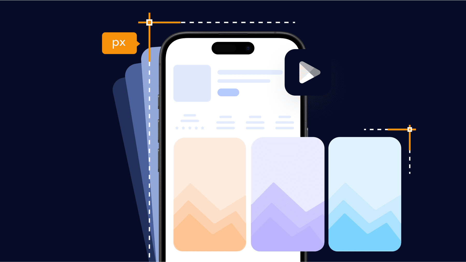
Google Play Store screenshot sizes and requirements for Android devices
To optimize app visibility in the Google Play Store, it is crucial to understand their screenshot size requirements for various device form factors.
Google regularly updates these specifications to accommodate the wide range of Android devices like phones, tablets, Chromebooks, foldables, and more.
For phone screenshots, the basic sizes are:
- 480 x 800 px: Considered the minimum size for all smartphones. This has been the baseline size spec for a long time.
- 720 x 1280 px: Recommended for most Android phones with HD/Full HD displays running Android 5.0 (Lollipop) or above.
- 360 x 640 px: For legacy Android 4.1-4.4 devices with lower res screens. You may optionally keep this size for backward compatibility.
Tablet screenshots start at:
- 600 x 1024 px: Minimum size for 7-inch tablets
- 720 x 1280 px: Minimum size for 8-inch and above tablets.
- 1024 x 1280 px: Recommended for tablets over 8 inches.
It is advised to include screenshots at multiple densities and aspect ratios to give reviewers a feel for how your app works on different screens.
Make sure to target the prevalent device tiers within each category for maximum coverage.
Always refer to the Google Play Developer Portal for the latest guidelines to future-proof your app store marketing assets.
By adopting these best practices, you can ensure an optimized app experience across a wide range of Android devices in multiple markets worldwide.
Basically, here is the table of complete Google Play Store App Screenshot Sizes for Android devices:
| Size | # of Screenshots | Size | Ratio |
| Android Phone | At least 2 At most 8 |
320 px to 3840 px |
Landscape 16:9 Portrait 9:16 |
| Chromebook and Google Play tablets | At least 4 At most 8 |
1080 px to 7680 px |
Landscape 16:9 Portrait 9:16 |
| Wear OS | At least 1 At most 8 |
384 px to 384 px |
1:1 |
| Android TV | At least 1 At most 8 |
– | – |
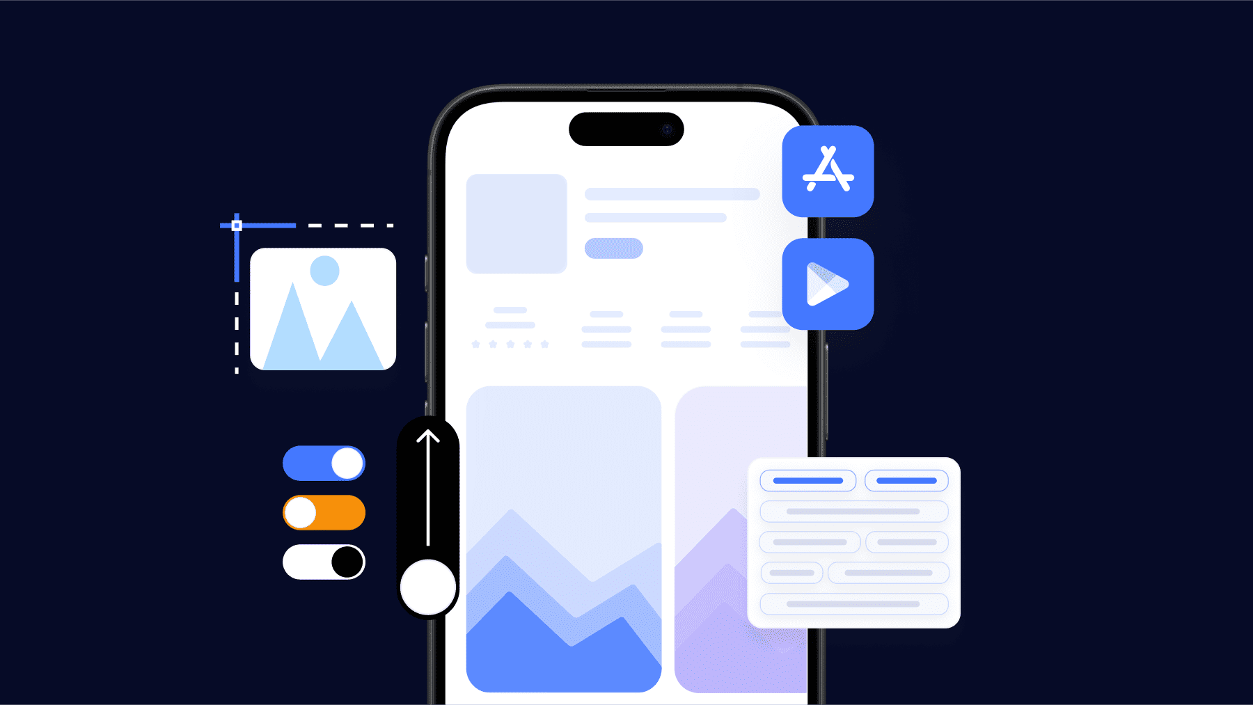
Creating compelling screenshots for app store optimization
While following Google’s technical specifications is important, it is also critical to create screenshots that appeal to users on an emotional level and convince them to install your app.
Here are some best practices for designing captivating screenshots:
- Show key features: Highlight 2-3 of your most important and unique features in each screenshot. Zoom or call out important elements to clearly demonstrate how those features work.
- Use accurate app previews: Do not photoshop or misrepresent app interfaces. Users should know exactly what to expect during the onboarding and usage process.
- Include task flows: For complex apps, showcase task completion or end-to-end workflows through a series of screenshots instead of isolated screens.
- Use compelling captions: Leverage each screenshot’s caption (30 characters max) to tease key features and benefits, address user pain points or ask relevant questions to intrigue viewers.
- Test on various devices: You can use emulators or layoffs from Google’s templates to preview screenshots on different screen sizes before submission. This improves relevancy.
By crafting visually engaging screenshots that authentically exemplify your app’s value, you can boost store visibility and conversions through powerful discovery.
Be sure to periodically refine screenshots based on analytics to continuously optimize the mobile customer journey.
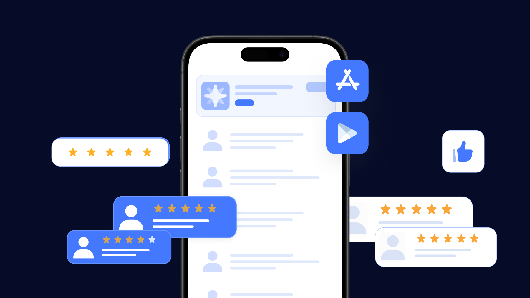
App screenshots examples
Uber
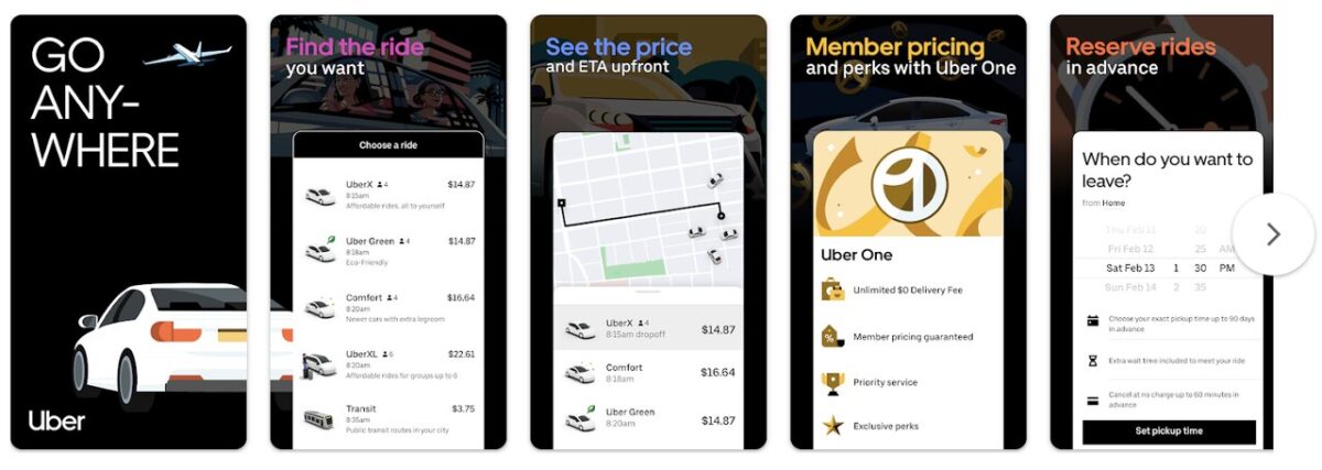
Uber adopts a minimalist design approach in its app store screenshots utilizing a dark background with colorful fonts and straightforward imagery to communicate the core app concept to prospective users in a clear yet visually appealing manner.
Through clean and simple screenshots, Uber can concisely yet effectively outline the primary application concept and the value proposition it provides to viewers in an easy-to-digest format.
This approach allows the company to efficiently highlight its main purpose and benefits to potential customers.
YouTube Music
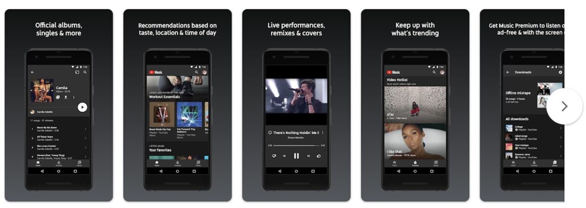
YouTube Music adopts a clean design approach in its Google Play Store screenshots using a dark background, an Android device in dark mode, white fonts, and straightforward images to elucidate the core app concept for prospective users.
By incorporating Android device mockups, YouTube Music additionally enables viewers to gain a high-level perspective of the app experience ahead of downloading.
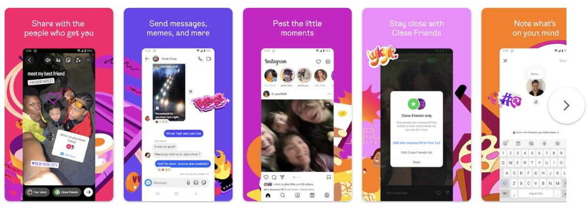
Unlike the more muted color schemes utilized by apps such as Uber and YouTube Music, Instagram opts for a vibrantly colorful visual design in its Google Play Store screenshots.
Through its use of vivid and saturated colors, Instagram outlines its core concepts and the value it delivers to users within its screenshots on Google Play.
Unlike the minimalistic tones favored by some other apps, Instagram leverages a highly colorful approach in its screenshots to convey its primary application ideas and selling points to the viewer in a lively and visually stimulating manner.
Monopoly GO!

Monopoly GO! concentrates its app store screenshots on elucidating the core objective of the game. Including a cover image and branded logo seeks to heighten brand recognition.
Through screenshots portraying actions like “Roll!”, “Build!”, “Steal!” and “Attack!” accompanied by corresponding captions, Monopoly GO! strives to convey the essential aim of play in a clear manner.
The visuals aim to elucidate the principal purpose and gameplay experience to viewers in an engaging format centered around achieving goals reminiscent of the classic Monopoly board game experience.
Tinder
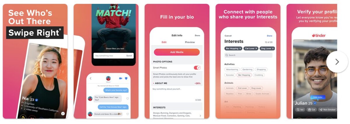
Tinder utilizes a guided walkthrough method within its app store screenshots, demonstrating to users how to interact with and utilize the application.
Across a set of 5 screenshots, Tinder successfully yet unambiguously outlines both the fundamental functions and intended purpose of the app.
Presenting the screenshots in a tutorial-like format, Tinder previews for users the main objective and navigation within the experience.
This screenshot approach instructs viewers on the primary workflow and reasons for using the app clearly and concisely.
App screenshots best practices for Android devices
Consider Dark Theme
With Android 10 and above, Google mandated system-wide support for dark themes to provide a more comfortable experience in low-light environments.
Research shows over 50% of Android users globally now spend significant time with their devices in dark mode.
It’s important to showcase that your app supports this accessibility and visual preference setting through dedicated dark theme screenshots. Some key points to keep in mind include:
- Demonstrate legibility of text/icons against dark backgrounds
- Show how any graphics/images are adjusted for darkness
- Highlight that your UI aligns with Android’s Material Design dark color palette
- Consider including captions like “Dark theme supported” for awareness
Including both light and dark theme screenshots reassures potential users about an optimized experience regardless of their chosen system settings.
It also conveys your app is developed following today’s UX best practices.
Consider making these screenshots periodically to highlight ongoing support for evolving OS functionality.
Supporting dark themes is a minimum standard today. Including visual proofs will boost trust for users to research your app on Google Play on phones with forced or scheduled dark modes.
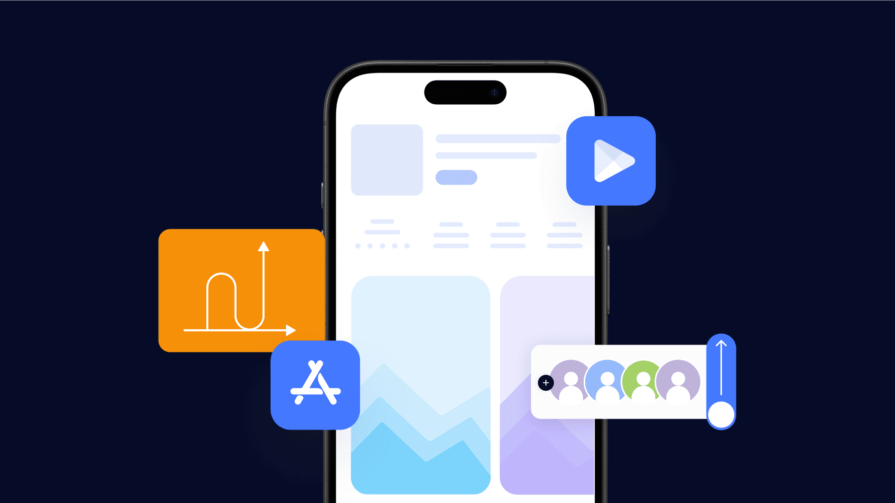
Highlight why your app Is worth downloading
Screenshots alone often cannot fully capture an app’s user experience and value proposition. Additional context is important to avoid potential confusion.
Here are some techniques to consider:
- Annotations: Overlay numbers, arrows, or text callouts on screenshots to reference and explain key interface elements.
- Progress indicators: For workflow screenshots, add step numbers to clearly depict feature sequences and flows.
- Mockup frames: Placing screenshot snippets within mock mobile device frames provides visual anchoring.
- Supplemental images: Diagrams, illustrations, or additional screenshots of menus/settings can complement the core screenshots.
- Video demonstrations: For especially complex features, quick 15-30 second videos embedded right in the listing are highly helpful.
- Text descriptions: Layered captions combined with descriptive blurbs beneath each screenshot offer layered context.
The goal is to transform static screenshots into a cohesive narrative through strategic supplemental materials. This helps viewers instantly understand even the most intricate of apps at a glance. A multi-pronged descriptive approach is ideal to fully illuminate an app’s value and potential.
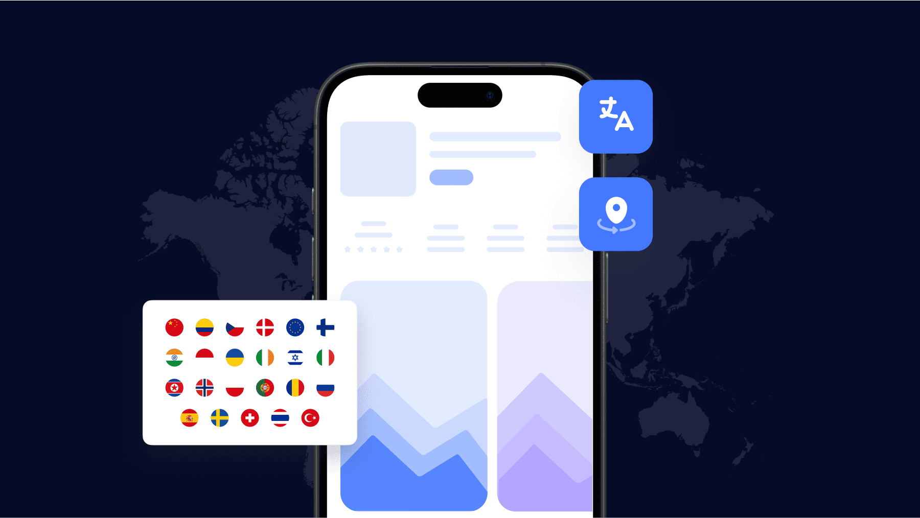
Localize screenshots
Localizing app store assets like screenshots, titles, and descriptions is crucial for success in different regions and languages.
Some key points when localizing screenshots:
Translate captions and any textual elements shown on screens to the local language.
- Use region-specific imagery, colors, and cultural nuances that will appeal locally.
- Consider local preferences – like in some Asian markets, users prefer full-bleed screenshots without system UI elements.
- A/B test variants by target country to see which perform better for that audience before wide launch.
- Integrate dynamic localization – allow captions and UI to automatically adjust based on user’s region/language settings.
- Consult localization experts if needed to ensure proper grammar, terminology, and tone for each market.
Localized screenshots reduce cognitive load for users browsing in their preferred language.
It helps build trust by demonstrating cultural insight. This boosts conversion funnel completion rates in niche languages worldwide.
Consistency in localized assets also aids search and discoverability across various global app storefronts.
Take the extra steps to localized to unlock new growth opportunities internationally.
Use native UI elements
Using consistent branding and designing according to Android’s official material guidelines helps create a sense of familiarity and navigability for users.
Some detailed best practices include:
- Adopt system-standard navigation patterns like bottom bars, side menus, and navigation drawers that users are already familiar with.
- Style buttons, labels, text fields, sliders, etc. to match Android’s material themes for recognizing native components.
- Integrate core UI elements like app bars, cards, dialogs, progress indicators, etc. rather than recreating their function.
- Honor design principles like elevation, responsive ink effects, and prominent app bars to cues from the platform.
- Consider dynamic colors, shapes, and animations introduced in the latest Android version.
- Test thoroughly across API levels for consistency in component styling and behavior.
Familiarity with the underlying OS translates as intuitiveness for users.
Screenshots portraying 100% custom elements risk undermining discoverability versus native-style UIs. So be sure to exemplify your proper integration of standard Android patterns.
Test on different Android versions
It’s important to ensure your app screenshots accurately represent the experience on different Android OS versions. Some tips for version testing include:
Use emulators to preview how screens will look and function on older APIs back to at least Android 5.
- Check for missing features, changed components, incompatibilities in low fragment shaders, etc.
- Categorize screenshots by API-level folders in the play console for specific targeting.
- A/B test various API-targeted screenshots to see which improve install rates.
- Periodically update screenshots when dropping support for older Android versions.
- Consult Android distribution share reports to focus on versions constituting large user bases.
Being aware of how Android has evolved helps optimize the cross-version experience.
Screenshots are a user’s first impression, so portray consistent, modern functionality to boost confidence in your app’s longevity.
How to generate and design App Store screenshots?
The methodology utilized for generating app screenshots is another critical factor to consider.
Some individuals or companies may prefer crafting the visuals entirely from scratch themselves, whereas others seek to leverage template-driven solutions as a time-saving measure.
Regardless of the approach, it is sensible to evaluate the various design and templating options available before committing to a specific workflow or set of tools.
By testing out different screenshot creation methods currently on the market, one can identify the most efficient and effective solutions relative to their unique needs and constraints.
The key is selecting a process for producing high-quality, results-driven screenshots.
Sketch – A popular design app that allows creating detailed mockups and annotating screenshots. Easy to create multi-device layouts. Supports exporting assets at required sizes.
Adobe Photoshop – Industry standard photo editing software. Useful for optimizing screenshots by editing colors, and removing backgrounds. Advanced tools for precise image corrections.
Avocode – Exports design files into realistic device frame previews. Lets you see Sketch/Photoshop designs exactly how they’ll appear on any screen size. Live updates as you design.
Iconifier – Automates exporting design files into all required app icon sizes and screenshots. Saves significant time over manual export/resizing of each asset.
Adobe XD – Strong prototyping software that lets you link screens to simulate interactions. Automatically generates screenshots of linked screens at required resolutions.
Mockupworld.co – Inserts your digital designs into realistic iPhone/iPad photos for social/email sharing. Gives viewers an accurate idea of how your app will look.
InVision – Prototype interactive mockups and share clickable previews online. Import Sketch/Photoshop files and simulate user flows via linked screens/artboards.
Axure – Advanced wireframing tool that dynamically generates screenshots of prototypes based on specified actions.
Conclusion
Following Google’s technical specifications and user experience best practices will help you create screenshots that optimize your app’s visibility and positioning on the Google Play Store.
However, the methods used to design screenshots are also an important consideration.
By experimenting with various tools that fit your workflow needs, you can establish an efficient process for generating high-quality, results-driven assets.
Regularly monitoring analytics allows refining your screenshots over time as usage trends evolve.
Although the mobile landscape continues expanding with new form factors, standardized sizing guidelines provide coverage for the majority of Android users today.
With discovery more critical than ever, compelling screenshots remain integral for attracting more users and growing your business on Google Play.
By employing a testing-focused, cross-platform approach grounded in data, your visuals can drive powerful install-based marketing globally.
This handbook will serve as your roadmap, packed with emerging trends, valuable insights, and the best ASO tools & resources. It aims to help you stay ahead of the competition and enhance your app marketing strategy for substantial growth in 2025 and beyond.