


This handbook will serve as your roadmap, packed with emerging trends, valuable insights, and the best ASO tools & resources. It aims to help you stay ahead of the competition and enhance your app marketing strategy for substantial growth in 2025 and beyond.
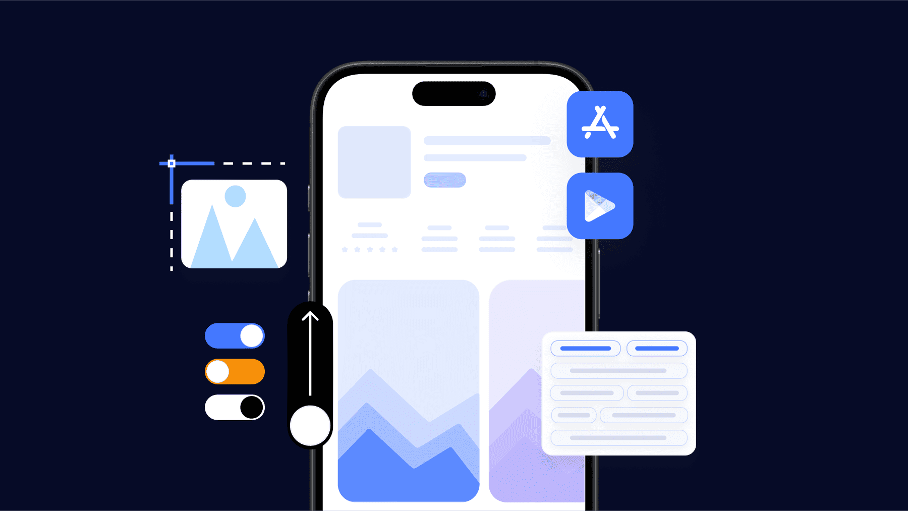
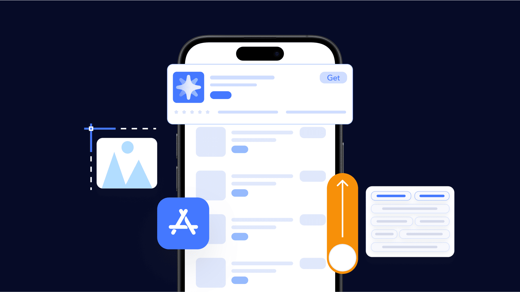
Apple App Store screenshots are one of the most important elements of your iOS app listing. They’re the first visuals users see when they land on your product page, and often the deciding factor in whether they install or move on.
Apple has clear guidelines for screenshot sizes, formats, resolutions, and placement, and following these rules is essential not only for App Store approval but also for effective app store optimization.
In this guide, we’ll walk through everything you need to know about Apple App Store screenshot sizes and requirements in 2026. Whether you’re submitting a new app, updating your listing, or trying to boost conversion rates, you’ll find the exact specifications and best practices you need to follow.
iPhone screenshot sizes for the App Store
iPhone screenshots are the most important visual assets for most apps. They’re the main screenshots shown in App Store search results and are often the first images users see when deciding whether to tap or install.
✴️ Note: If you’re managing listings across platforms, Apple’s requirements differ significantly from Google Play, especially when it comes to screenshot dimensions, orientation, and display logic. You can find a full breakdown in our Google Play Store screenshot sizes and guidelines.
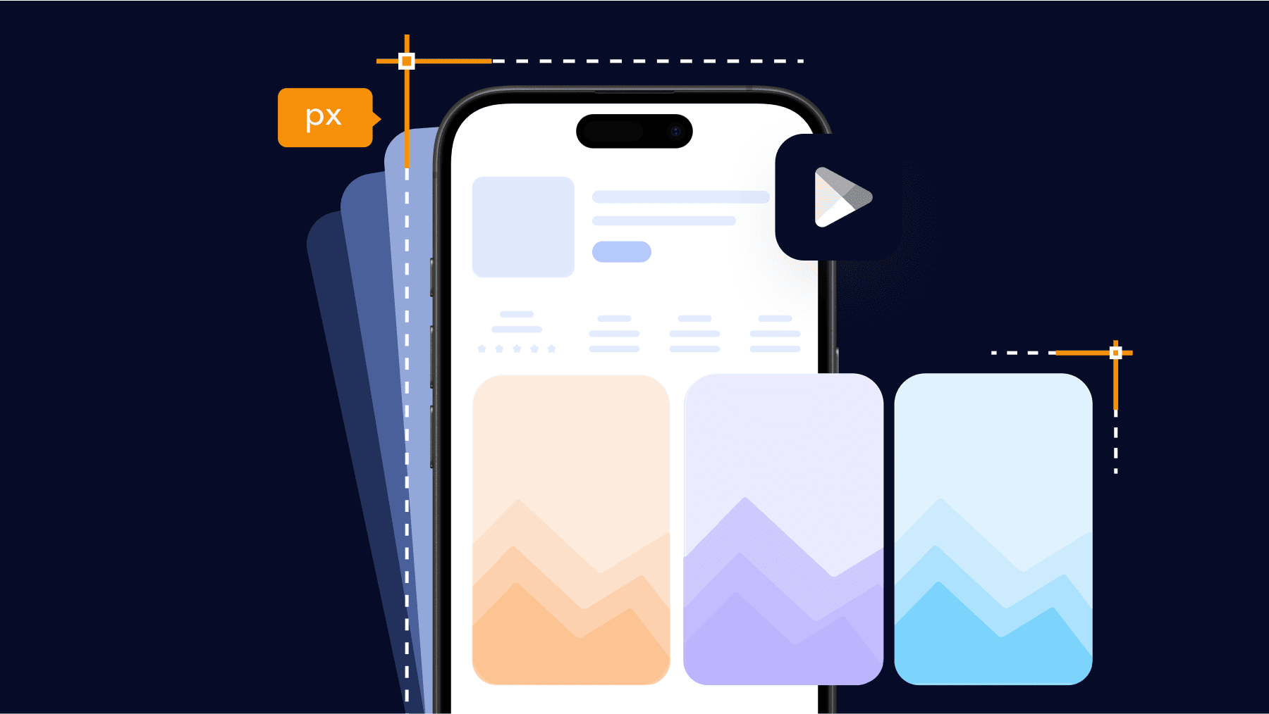
Apple does not accept arbitrary image sizes (random or custom dimensions). Each screenshot must match the exact pixel resolution (width × height) of a supported iPhone display. Uploading incorrectly sized screenshots is one of the most common reasons for App Store Connect upload errors.
Below you can find a clean table with the currently accepted iPhone screenshot sizes for App Store submissions.
iPhone App Store screenshot sizes (portrait)
| iPhone display class | Pixel resolution (width × height) | Aspect ratio | Typical devices |
| 6.7-inch display | 1290 × 2796 px | 19.5:9 | iPhone Pro Max models |
| 6.5-inch display | 1242 × 2688 px | 19.5:9 | iPhone XS Max, iPhone 11 Pro Max |
| 6.1-inch display | 1179 × 2556 px | 19.5:9 | iPhone Pro, iPhone 14 / 15 |
| 5.5-inch display | 1242 × 2208 px | 16:9 | iPhone 8 Plus and earlier Plus models |
iPhone App Store screenshot sizes (landscape)
| iPhone display class | Pixel resolution (width × height) | Aspect ratio |
| 6.7-inch display | 2796 × 1290 px | 19.5:9 |
| 6.5-inch display | 2688 × 1242 px | 19.5:9 |
| 6.1-inch display | 2556 × 1179 px | 19.5:9 |
| 5.5-inch display | 2208 × 1242 px | 16:9 |
Practical rules for iPhone App Store screenshots
1. Use portrait by default.
Most App Store browsing happens in portrait, and portrait screenshots perform better for the majority of apps. Only use landscape screenshots if your app is landscape-only or if the core experience truly depends on it (for example, games or video-first apps).
2. You don’t need to upload every size.
Apple allows screenshots to be uploaded for a subset of display classes. In practice, many teams upload only:
- 6.7-inch screenshots (to cover modern iPhones), and
- 5.5-inch screenshots (to satisfy older display requirements)
You can use App Store Connect to automatically scale these for compatible devices.
3. Exact resolution matters.
Screenshots must match Apple’s specifications pixel-for-pixel. Even small differences, such as exporting at 1284 × 2778 instead of 1290 × 2796, can trigger upload errors.
4. Orientation must match the UI.
A portrait app UI placed inside a landscape frame (or the reverse) is a common quality issue and can lead to rejection.
Once your iPhone screenshots are technically correct, the next step is making sure your iPad screenshots also meet Apple’s requirements, which follow different rules and are often misunderstood.

iPad screenshot sizes for the App Store
If your app supports iPad, iPad screenshots are required. Apple treats iPhone and iPad as separate device classes, which means iPhone screenshots can’t automatically cover your iPad listing. If the app runs on iPad, you need to upload at least one valid iPad screenshot to complete submission.
While iPad screenshots appear less frequently than iPhone screenshots in App Store search results, they still play an important role in conversion. This is especially true for apps where iPad usage is common, such as:
- productivity tools
- education apps
- creative and design-focused products
In these categories, users expect to see how the app takes advantage of the larger screen.
As with iPhone screenshots, Apple only accepts images that match exact native iPad display resolutions. Even small mismatches can cause upload or validation issues, so precision matters just as much here.
iPad App Store screenshot sizes (portrait)
| iPad display class | Pixel resolution (width × height) | Aspect ratio | Typical devices |
| 12.9-inch display | 2048 × 2732 px | 4:3 | iPad Pro 12.9-inch |
| 11-inch display | 1668 × 2388 px | 4:3 | iPad Pro 11-inch |
| 10.5-inch display | 1668 × 2224 px | 4:3 | iPad Air (older), iPad Pro 10.5-inch |
| 9.7-inch display | 1536 × 2048 px | 4:3 | iPad (standard models) |
iPad App Store screenshot sizes (landscape)
| iPad display class | Pixel resolution (width × height) | Aspect ratio |
| 12.9-inch display | 2732 × 2048 px | 4:3 |
| 11-inch display | 2388 × 1668 px | 4:3 |
| 10.5-inch display | 2224 × 1668 px | 4:3 |
| 9.7-inch display | 2048 × 1536 px | 4:3 |
Practical rules for iPad screenshots
If your app supports iPad, at least one iPad screenshot is required. Uploading only iPhone screenshots, even if the app runs perfectly on iPad, will block your submission in App Store Connect. This is a technical requirement, not a suggestion.
You can keep the same creative idea across iPhone and iPad screenshots, but you can’t reuse the same image file. The layout, messaging, and story can stay consistent, as long as the final screenshot matches an iPad-specific resolution.
For most apps, portrait is the safer choice. It works well for utilities, content apps, and products that feel similar across iPhone and iPad. Landscape screenshots tend to make more sense when the app is clearly designed around iPad workflows, such as design tools, editors, or games that rely on wider layouts.
You also don’t need to upload the maximum number of screenshots. If the iPad UI closely mirrors the iPhone experience, many teams limit themselves to three to five iPad screenshots. The goal is to highlight what actually changes on a larger screen, layout density, multitasking, or expanded views, rather than repeating the same story at a bigger size.
Once both iPhone and iPad screenshots are properly covered, the next questions usually come up around other Apple platforms, Mac, Apple TV, and Apple Watch, and whether screenshots are required for each of them.
Screenshot requirements for other Apple platforms (Mac, Apple TV, Apple Watch)
If your app is available on platforms beyond iPhone and iPad, Apple may require separate screenshots for those platforms as well. These screenshots are shown on platform-specific App Store pages and must follow different size and layout rules.
Not every app needs screenshots for every platform. Requirements depend on which platforms your app supports and whether you distribute a native experience on those devices.
Below is a practical breakdown of what’s required and when.
Mac App Store screenshot sizes (macOS apps)
If you distribute a macOS app (including Mac Catalyst apps listed on the Mac App Store), screenshots are required for the Mac listing.
| Display type | Pixel resolution (width × height) | Aspect ratio |
| Mac screenshots | 1280 × 800 px (minimum) | 16:10 |
Key notes for Mac screenshots:
- Apple allows flexibility on Mac compared to iOS, but screenshots must be at least 1280 × 800 px.
- You can upload larger images as long as the aspect ratio is respected.
- Screenshots should show the real macOS interface (menu bar, window chrome where relevant).
- iPad screenshots cannot be reused for Mac listings.
Apple TV screenshot sizes (tvOS apps)
If your app runs on Apple TV, screenshots are mandatory for the tvOS App Store.
| Display type | Pixel resolution (width × height) | Aspect ratio |
| Apple TV screenshots | 1920 × 1080 px | 16:9 |
Key notes for Apple TV screenshots:
- Screenshots must reflect a tvOS interface, not an iPhone or iPad screen scaled up.
- Use landscape orientation only.
- Focus on navigation, playback, or lean-back experiences typical for TV usage.
Apple Watch screenshot sizes (watchOS apps)
If your app includes a watchOS app, screenshots are required for the Apple Watch listing.
| Apple Watch size | Pixel resolution (width × height) |
| 45 mm | 396 × 484 px |
| 44 mm | 368 × 448 px |
| 41 mm | 352 × 430 px |
| 40 mm | 324 × 394 px |
Key notes for Apple Watch screenshots:
- Screenshots must show the watch UI only, without device frames.
- Messaging should be extremely minimal due to the small screen size.
- Many teams upload fewer screenshots (2-4) and focus on one core use case.
Practical guidance across platforms
Only upload screenshots for platforms your app actually supports. If your app doesn’t run on Apple Watch or Apple TV, including screenshots for those platforms will only create confusion, and can slow down review.
Each platform is reviewed independently. A fully compliant iPhone listing doesn’t guarantee approval on macOS, tvOS, or watchOS. Apple evaluates screenshots based on how your app behaves on each device, with different expectations for layout, interaction, and real-world use.
When you’re designing screenshots, prioritize context over strict consistency. Your visual branding can stay recognizable across platforms, but your screenshots should reflect how users actually experience the app on each device. What works on an iPhone won’t always translate to a Mac or a TV screen, and reviewers can tell when screenshots feel forced instead of native.
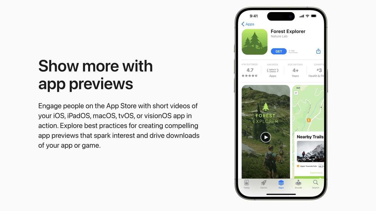
App preview video sizes and guidelines
App Preview videos are short product videos that appear before or alongside screenshots on your App Store product page. They autoplay silently in search results and on the app listing, which makes them powerful, but only when used correctly.
Apple treats App Previews as a product demonstration, not a marketing video. The rules are strict, and videos that look like ads or trailers are commonly rejected.
App Preview video sizes (by device)
Apple requires App Preview videos to match the same display resolutions as screenshots for the target device.
iPhone App Preview video sizes
| iPhone display class | Pixel resolution (width × height) | Orientation |
| 6.7-inch display | 1290 × 2796 px | Portrait |
| 6.7-inch display | 2796 × 1290 px | Landscape |
| 6.5-inch display | 1242 × 2688 px | Portrait |
| 6.5-inch display | 2688 × 1242 px | Landscape |
| 6.1-inch display | 1179 × 2556 px | Portrait |
| 6.1-inch display | 2556 × 1179 px | Landscape |
| 5.5-inch display | 1242 × 2208 px | Portrait |
| 5.5-inch display | 2208 × 1242 px | Landscape |
iPad App Preview video sizes
| iPad display class | Pixel resolution (width × height) | Orientation |
| 12.9-inch display | 2048 × 2732 px | Portrait |
| 12.9-inch display | 2732 × 2048 px | Landscape |
| 11-inch display | 1668 × 2388 px | Portrait |
| 11-inch display | 2388 × 1668 px | Landscape |
| 10.5-inch display | 1668 × 2224 px | Portrait |
| 10.5-inch display | 2224 × 1668 px | Landscape |
| 9.7-inch display | 1536 × 2048 px | Portrait |
| 9.7-inch display | 2048 × 1536 px | Landscape |
Supported App Preview video formats
| Requirement | Specification |
| File format | .mov, .mp4, .m4v |
| Video codec | H.264 |
| Frame rate | 30 fps (recommended) |
| Audio | Optional, but must be appropriate and non-promotional |
Core App Preview rules you should know
- You can upload up to 3 app preview videos per localization.
- Each video can be up to 30 seconds long.
- App Previews must show real, in-app footage captured from the app.
- Videos autoplay muted by default.
- Orientation (portrait or landscape) must match the app’s primary orientation.
What Apple allows, and rejects, in App Previews
When you create an App Preview, Apple expects you to show the app exactly as users experience it. App Previews are meant to demonstrate real functionality, not market the app.
Apple allows:
- Real screen recordings of your app in use
- Simple text callouts that explain what’s happening on screen
- Natural interactions such as taps, scrolling, and navigation flows
What Apple consistently rejects are previews that feel staged or promotional.
Apple does not allow:
- Actor footage, lifestyle shots, or marketing visuals
- Promotional slogans or sales language
- Claims like “best app,” “#1,” or competitor comparisons
- UI elements or features that don’t exist in the app
App Previews tend to work best when your app is highly visual, for example, design tools, games, or editors, where the value is easier to show than explain. They’re also helpful when onboarding benefits from a visual walkthrough.
For many utility or content apps, a strong set of screenshots performs just as well. App Previews are optional, not mandatory, and should only be used when they genuinely add clarity to your App Store page.
App Store screenshot requirements and rules you must follow
Before design or optimization comes into play, your screenshots must pass Apple’s technical and content review. Apple evaluates screenshots as part of the overall app review process, and even small violations can lead to rejection or a delayed release.
These rules apply across iPhone, iPad, and other supported Apple platforms unless otherwise specified.
1. Core App Store screenshot rules
Your screenshots must:
- Accurately represent the current version of the app
- Show real in-app UI, not marketing mockups or concepts
- Match the device type and screen size they are uploaded for
- Be clear, readable, and free of distortion or pixelation
Screenshots cannot include features, content, or pricing that users will not see after installing the app. Apple treats this as misleading behavior, even if the feature is planned for a future update.
Time-limited promotions and events should be communicated through Apple’s dedicated surfaces, not static screenshots. If you’re running campaigns or seasonal updates, our in-app events and promotional content guide explains where and how to showcase them properly.
2. Content restrictions to be aware of
Apple applies the same content standards to screenshots as it does to apps themselves. Screenshots must not contain:
- False claims, exaggerated promises, or unverifiable superlatives
- References to other platforms (for example, “Best app on Android”)
- Calls to action such as “Download now” or “Install today”
- Pricing claims unless clearly explained inside the app
If your app includes subscriptions, free trials, or in-app purchases, screenshots should not imply that the entire app is free unless that is factually accurate.
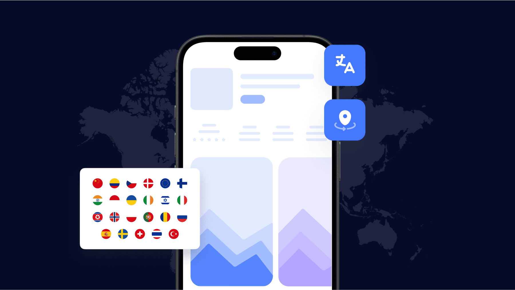
3. Localization and language rules
Screenshots must match the language of the App Store locale they are uploaded to. If you localize your product page:
- Text overlays must be translated correctly
- UI language should align with the selected storefront
- Mixed-language screenshots can be flagged during review
This is especially important for global launches and keyword-driven ASO strategies where localized screenshots are often a conversion lever.
4. Update and versioning expectations
Whenever your app UI changes significantly, Apple expects screenshots to be updated. Common triggers include:
- Major redesigns
- Navigation changes
- Feature removals or paywall changes
Uploading outdated screenshots that no longer match the app experience is one of the most common reasons for rejection after an otherwise successful binary submission.
Supported screenshot formats, resolutions, and file types
After sizing and compliance rules, the next source of errors is how screenshots are exported and uploaded. Even when the dimensions are correct, issues like unsupported formats, compression artifacts, or incorrect color profiles can cause upload failures or visible quality loss on the App Store.
This section covers the exact technical specifications Apple accepts and the practical choices that help you maintain visual quality.
Supported screenshot file formats
Apple supports a limited set of image formats for App Store screenshots.
| File type | Supported | Notes |
| PNG (.png) | Yes | Preferred for UI clarity and text sharpness |
| JPEG (.jpg / .jpeg) | Yes | Acceptable, but compression can reduce quality |
| GIF | No | Not supported for screenshots |
| WebP | No | Not supported |
| TIFF | No | Not supported |
Practical recommendation: Use PNG for most apps, especially those with text-heavy UI, thin lines, or light backgrounds. JPEG is acceptable for highly visual apps, but compression should be kept minimal.
Resolution and scaling rules
- Screenshots must be uploaded at exact native pixel resolutions for the target device.
- Apple does not allow arbitrary scaling or “close enough” sizes.
- Downscaled or upscaled images can appear blurry or be rejected during upload.
| Rule | What to do |
| Target resolution | Export at exact Apple-approved pixel size |
| Scaling | Avoid scaling after export |
| Retina handling | Always export at full resolution (1× UI at device pixel size) |
Do not rely on App Store Connect to fix resolution issues. If the file doesn’t match a supported size, it will fail validation.
Color space and quality considerations
While Apple does not strictly document color profile requirements, practical experience shows the following works best:
- Use sRGB color space
- Avoid wide-gamut exports (Display P3) unless you are confident in consistent color handling
- Disable aggressive image compression
This helps prevent unexpected color shifts once screenshots are displayed across different devices.
File size considerations
Apple does not publish a strict maximum file size per screenshot, but very large files can slow uploads and increase processing time.
| Best practice | Why it matters |
| Keep files reasonably compressed | Faster uploads, fewer processing issues |
| Avoid excessive metadata | Cleaner exports |
| Test upload early | Catch format or size issues before release day |
Transparency and backgrounds
- Transparent backgrounds are allowed technically, but not recommended.
- Screenshots should show the app UI clearly against a solid or realistic background.
- Transparent or floating UI elements can look broken or misleading in App Store contexts.
Common technical mistakes to avoid
- Exporting screenshots from design tools at the wrong scale
- Using JPEG compression that emphasizes artifacts around text
- Uploading screenshots with mismatched orientation metadata
- Mixing different color profiles across a screenshot set
How to design App Store screenshots for ASO and conversion
Once sizes, formats, and rules are correct, screenshots become a conversion asset. Their job is to help users understand your app’s value quickly and decide whether to install. This is where app store screenshot design and ASO intersect.
Good screenshot design is about clarity, hierarchy, and relevance to user intent.

Screenshots don’t work in isolation, they’re evaluated alongside your app name, subtitle, and icon. For a deeper look at how icons influence tap-through and first impressions, see our app icon design guidelines.
Start with user intent, not features
Users land on your App Store page with a goal. Your first screenshots should reflect that goal immediately.
Before designing, ask:
- Why would someone search for this app?
- What problem are they trying to solve right now?
- What outcome do they want after installing?
Your first 1- 3 screenshots should answer these questions directly. Feature depth can come later.
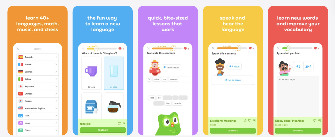
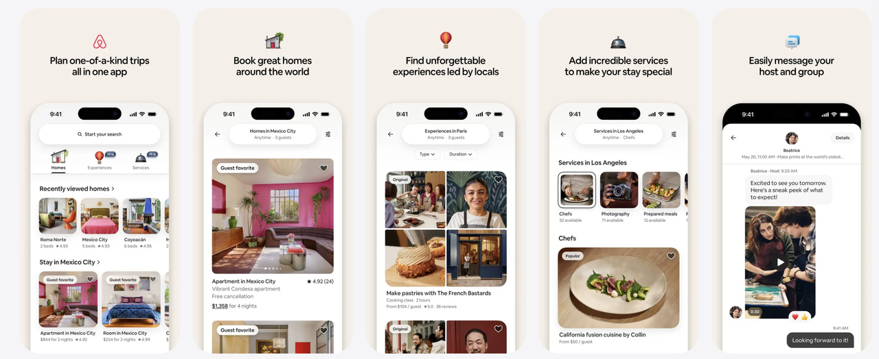
Structure screenshots as a visual story
Screenshots work best when they follow a clear sequence:
- Primary value – what the app does and who it’s for
- Key benefit – how it helps or saves time/money/effort
- Proof or clarity – how it works in practice
This structure helps users scan left to right and understand the app without reading the description.
Use text overlays carefully
Text overlays are allowed and widely used, but they must be short and readable at small sizes, focused on benefits, not feature lists and consistent in tone and terminology.
Avoid long sentences, marketing slogans without meaning, and claims you can’t clearly support in-app.
A good rule is if the overlay can’t be understood in under two seconds, it’s too long.
Show real UI, not abstract concepts
Apple expects screenshots to show real in-app UI. From a conversion standpoint, this also builds trust.
Best practices include:
- Full-screen UI captures
- Clear focus on the main action per screen
- Highlighting interactions users will actually perform
If you annotate UI (for example, arrows or highlights), keep them subtle and consistent.
Design for readability on mobile
Most users view screenshots on small screens. To maintain clarity:
- Use large, high-contrast text
- Avoid placing text near screen edges
- Ensure UI elements are not visually crowded
Always preview screenshots at actual mobile size, not just on a desktop canvas.
Align screenshots with keywords and positioning
While screenshots don’t directly affect keyword rankings, they support conversion after discovery.
This relationship between discovery and conversion is a core part of App Store Optimization. If you want to understand how screenshots, keywords, metadata, and ratings work together, our comprehensive App Store Optimization guide covers the full picture.
This means your visuals should align with:
- Your primary keyword themes
- The language users expect from search results
- The promises implied by your app name and subtitle
If users search for a specific use case, they should see it reflected visually.
To do this effectively, teams need clarity on which keywords actually drive visibility and installs. With MobileAction’s keyword tools, you can identify high-intent terms and ensure your screenshot messaging reflects the language users already associate with those searches.
App Store screenshot best practices for iOS
1. Lead with value, not features
Your first screenshots should answer why the app matters, not what buttons it has. Start with the outcome or problem the app solves, then support it with real UI. Features only make sense once the value is clear.
2. Communicate one idea per screenshot
Each screenshot should make a single point that can be understood in one glance. When a frame tries to explain multiple things, users stop scanning. Simplicity increases comprehension and trust.
3. Design for how screenshots are actually viewed
Most users see screenshots at reduced sizes, especially in search. Headlines must be readable without zooming, and UI should remain recognizable. If it only works at full resolution, it won’t convert.
4. Use real UI and realistic content
Screenshots should reflect the real product experience. Use actual screens, real data examples, and in-app terminology. Avoid abstract mockups or “perfect” placeholder content that doesn’t exist in the app.
5. Keep structure consistent across the set
A stable layout, typography system, and visual rhythm help users scan faster. Consistency reduces cognitive load and makes the app feel more polished and trustworthy.
6. Order screenshots like a story, not a spec sheet
Start with the main value, move to the primary action, then show supporting features or use cases. Users should feel guided, not overwhelmed by unrelated screens.
7. Use text overlays to clarify, not to sell
Text should explain what the user is seeing and why it matters. Avoid marketing language, claims, or anything that sounds promotional. Neutral, descriptive copy performs better and stays review-safe.
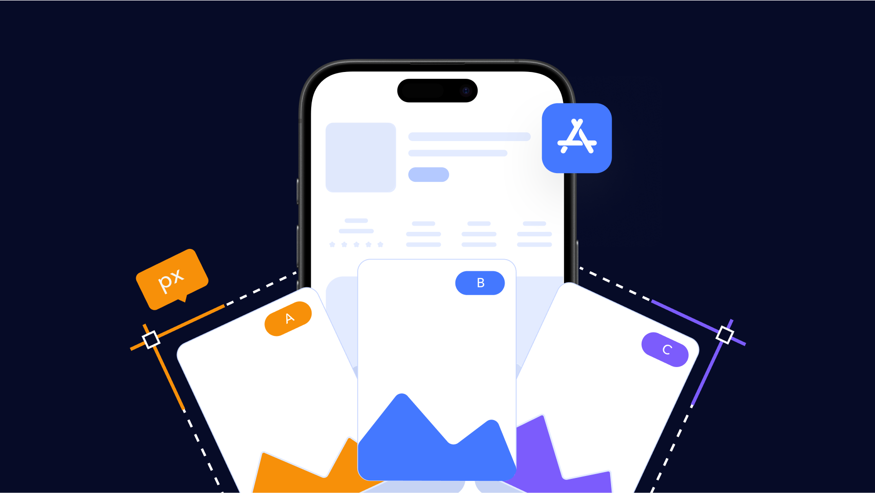
8. Treat screenshots as a living asset
Strong teams revisit screenshots regularly. Small changes, like refining the first message or reordering frames, often outperform full redesigns. Screenshots should evolve as positioning and user intent evolve.
Common App Store screenshot mistakes and rejection reasons
Even well-designed screenshot sets can fail if they introduce confusion, misrepresentation, or rule violations. In practice, most problems fall into a small number of patterns. Understanding these patterns helps you avoid rework, delayed reviews, and lost conversion.
One of the most common mistakes is leading with the wrong message. When the first screenshot focuses on branding, slogans, or vague promises instead of clear value, users don’t immediately understand what the app does. This hurts tap-through in search and weakens the entire screenshot set, no matter how strong the later frames are.
Another frequent issue is overloading screenshots with information. Screens that try to explain multiple features, workflows, or benefits at once become hard to scan. Users don’t slow down to decode them, they simply move on. This is especially damaging on the iPhone, where screenshots are often viewed at reduced sizes.
Misrepresentation of the app experience is a major review risk. Screenshots that show features not available at install, redesigned UI that hasn’t shipped yet, or premium features without clear context can lead to rejection. Apple expects screenshots to reflect what a user can actually experience, not what’s planned or idealized.
Text-related mistakes are also common. While text overlays are allowed, problems arise when teams use:
- Promotional or superlative language (“best”, “#1”, “top-rated”)
- Competitor comparisons
- Pricing or discount claims that may change
- References to App Store rankings or awards
These elements often trigger review issues because they’re unverifiable or misleading.
Inconsistent orientation and layout can also hurt both approval and performance. Mixing portrait and landscape screenshots for the same device type creates visual friction and can confuse users about how the app actually works. Similarly, inconsistent typography or layout across screenshots makes the set feel disjointed and harder to scan.
Localization issues are another silent performance killer. Uploading English screenshots for non-English markets, using incorrect currency formats, or showing culturally irrelevant examples can reduce trust and conversion, even if the app itself is localized.
Finally, many teams underestimate technical export mistakes. Screenshots that are off by a few pixels, use unsupported formats, or include heavy compression artifacts may fail upload validation or appear blurry on the App Store. These issues are easy to miss internally but obvious to users.
Avoiding these mistakes doesn’t require more creativity, it requires discipline. Clear value, honest representation, technical accuracy, and editorial restraint go further than elaborate visuals or aggressive messaging.
Conclusion
Getting apple app store screenshot sizes right is about more than just following a checklist. Screenshots sit at the intersection of compliance, user trust, and conversion. They must meet Apple’s technical and review requirements while clearly explaining your app’s value in seconds.
If you approach screenshots in the right order, first sizing and formats, then rules, then design and best practices, you reduce the risk of rejection and improve your chances of converting traffic into installs.
As a final check before submission, make sure:
- Sizes and resolutions match Apple’s supported device groups
- Screenshots reflect the current app experience accurately
- Text overlays are readable, honest, and useful
- iPhone, iPad, and other platforms are handled separately
When screenshots are treated as a core part of your Apple App Store strategy, not an afterthought, they become one of the most effective tools for both ASO and conversion.
To go a step further, ASO tools help you analyze top-performing competitors, validate visual messaging against keyword intent, and track how listing changes impact conversion over time.
Sign up for free to MobileAction to explore App Store insights and make more confident optimization decisions before your next submission.
Frequently asked questions
How many screenshots can I upload to the App Store?
You can upload up to 10 screenshots per device type and per localization. This applies separately to iPhone, iPad, and any other supported Apple platforms. You don’t need to use all 10, but you should include enough screenshots to clearly explain the app’s value and core experience. For most apps, 5-7 well-structured screenshots are sufficient.
Do I need to upload separate screenshots for iPhone and iPad?
Yes. If your app supports both iPhone and iPad, Apple requires separate screenshots for each device class. iPhone screenshots cannot be reused for iPad because the resolutions and aspect ratios are different. Even if the UI is similar, the files themselves must match valid iPad screenshot sizes.
Are App Store screenshots mandatory?
Yes. At least one screenshot is required for each supported device type. If your app runs on iPhone, iPhone screenshots are mandatory. If it also runs on iPad, iPad screenshots are mandatory as well. Without them, App Store Connect will not allow submission.
Are text overlays allowed on App Store screenshots?
Yes, text overlays are allowed and commonly used. However, they must be descriptive and factual. Apple does not allow promotional claims, superlatives, competitor comparisons, or references to rankings or awards. Text should clarify what the user is seeing, not try to persuade with marketing language.
What image formats does the App Store support for screenshots?
Apple supports PNG (.png) and JPEG (.jpg / .jpeg) formats for screenshots. PNG is generally recommended for UI clarity and text sharpness. Other formats such as GIF or WebP are not supported.
Further reading
This handbook will serve as your roadmap, packed with emerging trends, valuable insights, and the best ASO tools & resources. It aims to help you stay ahead of the competition and enhance your app marketing strategy for substantial growth in 2025 and beyond.