


Looking to boost your app's visibility and acquire more users? Our 2025 ASO Report is your ultimate guide to navigating the evolving app store landscape. Packed with data-driven insights, keyword trends, and top-ranking app strategies, this report will equip you with the knowledge to optimize your app's presence and achieve organic growth.
Your iOS app icon is the first thing people notice. They see it in App Store search, on the Home Screen, in Spotlight, and in Settings. With iOS 26, Apple introduced Liquid Glass design, a new visual language that gives every icon soft depth, subtle light play, and a sense of motion. If your current icon looks flat or outdated, it can possibly reduce tap-through rate and conversion rate.
In this blog post, you’ll learn how to redesign (or create) a Liquid Glass icon that:
- Meets every iOS app icon size requirement
- Follows Apple’s Human Interface Guidelines (HIG)
- Uses Icon Composer (Apple’s tool for layered icons) and Product Page Optimization (PPO) to test what actually improves downloads
Finally, you will learn how to design your app icon for iOS 26, maintain your brand identity, and position your app for stronger organic growth.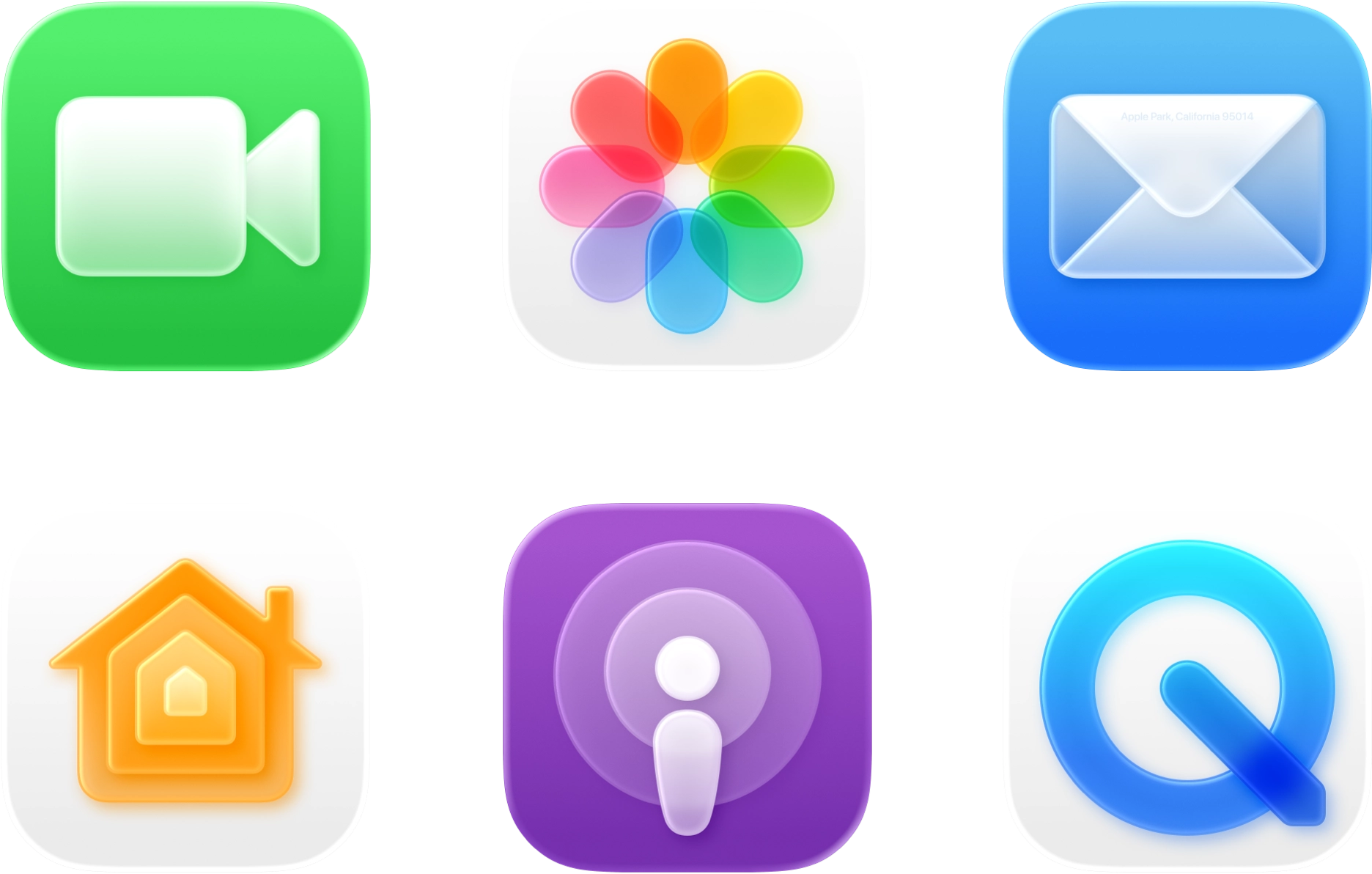
Key takeaways
- Follow Apple Liquid Glass design standards: iOS 26 adds depth and lighting. Icons that ignore this can feel outdated.
- Work from one master file. Design at 1024 × 1024 px (PNG, no transparency). Xcode creates the sizes.
- Keep it clear. One simple, recognizable shape beats tiny details.
- Test on real phones. Try different wallpapers and widgets to check contrast and visibility.
- Use data, not guesses. A/B test up to three icon versions in PPO and track tap-through (TTR) and conversion (CVR).
Why your Liquid Glass app icon matters in 2025
Apple now renders every iOS 26 icon using the Apple Liquid Glass design system, introducing realistic depth, translucency, and adaptive highlights. Icons that don’t follow this visual language appear outdated and can receive significantly fewer taps.
As part of Apple’s latest ecosystem updates, these visual and performance changes also continue to shape how developers approach mobile user acquisition and conversion optimization.
Here’s the practical impact in 2025:
- Visibility at every touchpoint. Your app icon appears in App Store search results, product pages, and across the entire Apple ecosystem. Under the Apple Liquid Glass design, clarity and balance are more important than ever. If your icon looks noisy or unclear, users may lose interest before even reading your title, app subtitle, or screenshots. Apple’s HIG continues to emphasize simplicity, recognizability, and system consistency.
- Perceived quality. HIG-guided icons feel consistent with the system, which signals polish and reliability. In contrast, mismatched styling (e.g., heavy outlines, busy textures) breaks trust fast.
- Direct testability (and accountability). PPO lets you A/B-test up to three icon variants and compare engagement against your control. This is the fastest way to measure impact.
- Tied to conversion. In App Store Connect, CVR equals downloads divided by unique device impressions. Your icon is the first thing people notice. When you optimize it using Apple’s Liquid Glass design, you can often see higher tap-through and conversion rates. Understanding how to use App Store Connect also helps you interpret these metrics accurately.
Pro tip: Don’t just optimize your own icon, watch your competitors too. Use Creative Monitoring tools (like MobileAction’s) to see when they update their icons, compare designs side by side, and correlate those changes with shifts in their rankings or conversion performance.

Apple Liquid Glass interface: What changed in iOS 26?
Apple’s design evolution has always mirrored changes in technology and user expectations. From skeuomorphism (a style that imitates real-world materials and textures) to minimalism (a clean, flat approach that removes visual noise), and now to the Apple Liquid Glass design, each era redefines how digital interfaces look and feel. In 2025, with iOS 26, Apple has moved from static visuals to dynamic, light-responsive environments that feel more natural and immersive.
- Skeuomorphism (Pre-iOS 7): Design mimicked real-world objects, often using heavy textures and realistic effects.
- Flat design (iOS 7 – iOS 15): Apple simplified visuals by moving away from real-world textures in favor of flat colors and minimal gradients, with emphasis on clarity and usability.
- Glassmorphism (iOS 15 – 2025): A return to depth with semi-translucent elements, allowing light to pass through while maintaining clarity.
- Liquid Glass (iOS 26): A more fluid, dynamic system where elements like icons, toolbars, and backgrounds reflect and refract light in real-time, creating a lively, ever-changing user experience.
This transition to Liquid Glass emphasizes depth, fluidity, and dynamic interaction with the user. Icons, controls, and navigation bars no longer sit flat on the screen; they now appear floating, layered, and responsive to ambient light and surrounding content.
Core principles of iOS app icon design in 2025
Liquid Glass doesn’t replace Apple’s core icon design principles, but adds new visual dynamics you should consider.
1) Focus on clarity and recognizability
Simplicity remains your strongest asset in the Apple Liquid Glass design. Define your icon’s purpose in three words or fewer (for example, “PDF scanner” or “budget tracker”). If it takes longer to describe, simplify the concept; the best Apple Liquid Glass icons rely on a single, clear idea.
What to do
- Start from one strong silhouette that represents the app’s core value.
- Remove micro-details; keep elements bold and readable.
- Keep the primary shape centered so masking and rounded corners never cut it off.
2) Design for scalability and small sizes
Your 1024 × 1024 app icon might look stunning on your design canvas, but most users will only see it at 60 × 60 pixels or smaller, especially in App Store search results, widgets, or notifications.
The Apple Liquid Glass design amplifies visual depth and lighting, but it won’t fix icons that lose clarity when scaled down.
What to do
- Keep it simple. Avoid tiny or complex details that disappear when the icon is reduced in size. Focus on clean, strong shapes instead.
- Ensure balance and contrast. Your icon should stay clear and recognizable whether viewed on a small watch screen or a large Mac display.
- Test across modes. The new iOS icons introduced in iOS 26 automatically adapt to lighting and motion effects, but legibility still depends on your core silhouette. Clean edges and strong contrast help your icon stay consistent.
3) Design for Liquid Glass dynamics
In the Apple Liquid Glass design, icons are no longer flat images; they’re multi-layered, light-responsive artworks that interact with the Apple Liquid Glass interface. Each icon combines foreground, mid-ground, and background layers rendered with soft depth, translucency, and dynamic bright light reflections (specular highlights). These effects make your Apple Liquid Glass icons feel tactile and alive.
When creating your new iOS icons, build them in layers and let the system handle lighting behavior.
What to do
- Use bold, contrasting colors, for example, light symbols on dark backgrounds or dark symbols on light ones.
- Check contrast ratios to keep your icon readable, especially in iOS 26’s tinted and clear icon modes, where lighting and transparency can affect visibility.
4) Align with the new icon shape
iOS 26 slightly rounds the rectangle and applies the mask automatically. Apple’s docs warn: “The system applies masking to produce your final icon shape… Keep elements centered to avoid clipping.” – Apple Developer.
Combine that with the broader move toward rounder UI corners across iOS 26 UI elements.
What to do
- Keep all essential shapes inside the central 70% of the canvas.
- Avoid thin borders that align exactly with the mask edge; they’ll look uneven once masked.

Key features of Apple Liquid Glass design for app icons
Design your Liquid Glass app icon so it behaves like native glass across iOS, iPadOS, macOS, and watchOS. Below are the pillars Apple emphasizes, and how to apply them.
| Pillar | What it means | Practical design guidance |
| Multi-layer construction | A Liquid Glass icon is no longer a single flattened PNG. You create separate foreground and background layers in Icon Composer, then hand one multilayer file to Xcode. | • Keep foreground shapes bold and easily recognizable. • Use a simple, low-contrast backdrop so specular highlights (bright light reflections) stay crisp. |
| Depth & dynamic lighting | The system renders soft inner shadows and specular highlights that move as the device shifts or the user toggles light/dark mode. | • Avoid busy textures, clean edges give the highlight a smooth path. • Preview depth in Icon Composer’s real-time lighting pane before export. |
| Subtle translucency | Portions of the icon can pick up color from the wallpaper, giving a glass-on-glass feel. | • Test on bright and dark wallpapers; highly saturated backdrops can wash out pale icons. • Limit translucency to background layers so the focal silhouette stays opaque. |
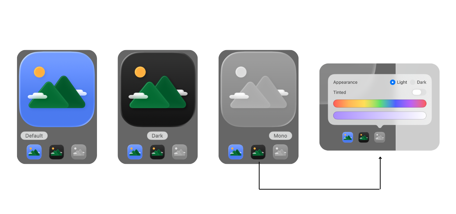
| Adaptive appearances | Apple now supports six appearances: Default Light/Dark, Clear Light/Dark, Tinted Light/Dark. | • Supply all variants in Icon Composer so your icon always looks intentional. • Keep the silhouette identical; change only background tone to preserve recognition. |
| Cross-platform reach | One Liquid Glass icon file travels to iOS, iPadOS, macOS (Tahoe), and watchOS without extra work. | • Align brand colors and lighting so the icon feels native everywhere. • For tvOS and visionOS, you still deliver a traditional AppIcon asset catalog. |
| Conversion-friendly testing | Because the icon is now a discrete, layered asset, you can A/B-test treatments in PPO and keep only what lifts tap-through rate TTR and CVR. | • Ship no more than three icon variants per test. • Track results in App Analytics and promote the winner globally. |
Apple Human Interface Guidelines (HIG) for iOS 26 icons
Apple’s Human Interface Guidelines (HIG) summarize everything you need to create icons that look native and meet App Store standards. If you follow these rules, your Liquid Glass app icon will display correctly across all iOS 26 appearances, pass review smoothly, and give users a strong first impression.
1. Canvas & mask
- Design on a square canvas; let iOS apply corner radii.
- Use a 1024 × 1024 px PNG master, fully opaque, no transparency.
- Don’t fake borders or bevels; the system adds highlights for you.
2. Safe zone & simplicity
- Keep essential shapes inside the built-in safe zone; edge bleed can clip under masking or appear haloed by specular light.
- The best new iOS icons under Apple’s Liquid Glass system are simple, memorable, and instantly recognizable.
3. Color & contrast
- Design first in Default Light, then adjust for Dark, Clear, and Tinted variants.
- Check legibility on busy and minimalist wallpapers (screenshot your Home Screen with popular iOS defaults).
- The Apple Liquid Glass interface adapts reflections dynamically, so keep your palette bold and your symbol opaque for clarity.
4. Create layered artwork with Icon Composer
- Import foreground/background assets and tune Liquid Glass parameters (frostiness, highlight intensity).
- Preview each appearance live, then export a single multilayer icon to Xcode.
5. Size requirements & delivery
| Platform | Preferred delivery | Why |
| iOS / iPadOS / macOS / watchOS | Multilayer Liquid Glass .iconset via Icon Composer | Enables adaptive lighting and appearances |
| tvOS & visionOS | Traditional AppIcon asset catalog | Current OS versions haven’t adopted Liquid Glass for large poster icons |
How to design an iOS 26 app icon (step by step)
Your workflow should mirror the system: build layered artwork, tune lighting in Icon Composer, and preview appearances before export.
Below is a clear, actionable workflow that walks you from the first audit through to App Store submission and A/B testing, every step aligned with Apple’s latest HIG recommendations.
Step 1: Set up your environment
Install the latest version of Xcode to access the new iOS 26 build tools. Then, download Icon Composer and the updated icon grids from Apple Design Resources. These files ensure your workflow aligns with the Liquid Glass rendering system and the correct 1024 × 1024 px canvas setup.
Apple reference: Icon Composer & grids
Step 2: Audit your current icon
Before starting, take screenshots of your existing icon in different contexts: App Store search results, Home Screen, Settings, and Spotlight. Look for visual issues such as a flat appearance, poor contrast on dark wallpapers, or shapes cut off by the icon mask. If you notice any of these, it’s time for a redesign. These signs indicate it’s time to upgrade to Apple Liquid Glass icons that feel native to iOS 26.
Apple reference: HIG > App icons
Step 3: Prepare layered artwork
Open your design tool, Figma, Sketch, or Illustrator, and create a 1024 × 1024 px square canvas. Build your design using multiple layers: foreground, mid-ground, and background. Avoid adding baked-in shadows, highlights, or gradients. Keep elements clean and separated for Icon Composer to interpret correctly. Export each layer as SVG (preferred) or PNG files.
Apple reference: HIG layer design & size specs
Pro tip: In Figma, you can use the built-in Glass effect tool to simulate the Liquid Glass look during design exploration. It’s not required for export, but it helps preview how transparency and lighting might behave.
Step 4: Create a new Icon Composer file
Open Icon Composer through Xcode ▸ Open Developer Tool ▸ Icon Composer. Start a new file and save it as something like AppIcon.icns. Limit the project’s target platforms to iOS, iPadOS, and macOS to keep your focus on the Liquid Glass-compatible systems.
Apple reference: Creating with Icon Composer 
Step 5: Import and organize layers
Drag your background, middle, and foreground files into Icon Composer. Order them from back to front.
- Background
- Mid-layers
- Foreground
- Accents
Name layers clearly (e.g., 01-Background, 02-Foreground).
Apple reference: Icon Composer layering
Step 6: Apply Liquid Glass effects
Select each layer group and open the Liquid Glass panel.
- Keep Specular enabled for bright, glass-like highlights.

- Adjust Blur slightly to achieve a frosted texture without losing detail.
- Use Translucency only on the background to maintain readability.
Preview your adjustments using the lighting dial in the toolbar.
Apple reference: Liquid Glass material controls
Step 7: Define appearance variants
Switch through the Default, Clear, and Tinted appearance modes within Icon Composer. Check that your icon maintains clear contrast and consistent shape in every mode. Only modify background hues between variants; the foreground symbol should remain identical across all.
Apple reference: Appearance variants guidance
Step 8: Export to Xcode and replace legacy icons
Once your design looks consistent, save and drag the Icon Composer file directly into your Xcode project navigator. Xcode automatically generates all required sizes and replaces the old AppIcon asset catalog for compatible OS versions. For older systems, it will automatically generate flattened PNGs.
Apple reference: Adding Icon Composer file
Step 9: Validate on real devices
Run your build on a physical iPhone with iOS 26 installed. Check your icon under different Home Screen settings: light, dark, clear, and tinted modes, and on various wallpapers. Look for any clipping, aliasing, or muddiness in translucent areas. Adjust your source layers if needed for clarity.
Apple reference: Adopting Liquid Glass ▸ See your app with Liquid Glass
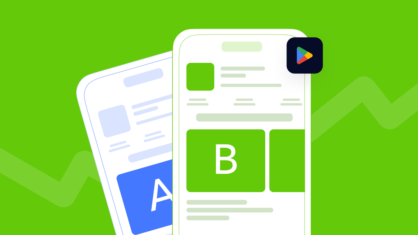
Step 10: A/B test with Product Page Optimization
Open App Store Connect ▸ Product Page Optimization and create up to three icon variants to test. Run each test for at least 14 days to collect reliable data on TTR and CVR. Once you have statistically significant results, promote the winning version globally for maximum impact. This is one of the most reliable ways to discover how to boost app downloads through data-backed design.
Apple reference: PPO & testing icons
For example, take a look at Apple’s own Product Page Optimization example featuring Peak Brain Training:
They tested three different app icon styles, a control, an orange version, a robots icon, and a brain icon. After 44 days, the brain icon outperformed the rest.
How to test your iOS app icon?
1. A/B test with Product Page Optimization
In App Store Connect, run icon treatments and monitor impressions, conversion rate, percent improvement, and confidence level for each variant vs. baseline. Apple reports estimated conversion rate and lift with a credibility interval, so you’re not guessing.
How to use: Test one variable at a time (icon only). Let tests run to significance; don’t stop early on noise.
2. Track the right ASO metrics
In App Analytics, monitor Product page conversion rate (downloads ÷ unique product page views), plus first-time downloads and redownloads. Icons influence taps and expectations, which then affect conversion.
3. Benchmark competitors visually
Use MobileAction’s Creative Monitoring to:
- See category-level icon patterns (color clusters, shapes) and avoid blending in.
- Compare with up to five apps side-by-side before/after your redesign to sanity-check distinctiveness.
Pair with Keyword Trends and Organic CPP Results to see whether your visual and keyword strategies reinforce each other (e.g., a “PDF scanner” icon style alongside custom product pages that target “scan to PDF”).
Conclusion: How to design an app icon that fits iOS 26’s Liquid Glass
Aligning with Apple’s Liquid Glass system ensures your icon feels native across iOS 26 while staying faithful to your brand. The most successful icons in 2025 are those that balance clarity, brand consistency, and adaptability. When you design, focus on the essentials:
- A simple, meaningful silhouette that expresses your app’s purpose
- Colors that remain balanced and visible in light, dark, and clear modes
- Natural lighting and soft depth that harmonize with Apple’s system reflections
By following Apple’s Human Interface Guidelines, testing variations with Product Page Optimization, and benchmarking your design against competitors in MobileAction’s Creative Monitoring, you’ll ensure your app icon not only fits the iOS 26 environment but also stands out across all Apple platforms.
Frequently Asked Questions
How do I redesign my app icon for iOS 26 without losing brand identity?
Keep your core symbol and color palette, but rebuild it with foreground and background layers inside Icon Composer. This approach lets the system add glass effects automatically while your logo and brand color remain consistent. Apple’s Human Interface Guidelines (HIG) recommend keeping the silhouette identical across all appearance modes (Default, Clear, Tinted) so recognition never drops.
What tools should I use to create a Liquid Glass app icon?
Apple recommends two main tools:
- Icon Composer (for layered, system-rendered icons).
- Xcode 26 or later (for testing and exporting).
You can design the artwork in Figma, Sketch, or Illustrator, export layers as SVG or PNG, then assemble them in Icon Composer. This setup ensures your icon meets Apple HIG iOS 26 requirements and passes review without rejections.
Will Liquid Glass icons affect my rankings or ASO visibility?
Not directly, but indirectly yes. Higher TTR and CVR signal stronger relevance to Apple’s ranking system. Apps with refreshed, native-looking icons tend to appear more trustworthy and receive better engagement metrics, both of which influence organic growth and keyword performance over time.
What are common mistakes when designing a Liquid Glass app icon?
The common mistakes you should try to avoid are;
- Adding your own shadows, borders, or reflections instead of letting the system handle them.
- Ignoring contrast ratios across light, dark, and tinted modes.
- Over-detailing shapes that blur at small sizes.
- Forgetting to preview on real devices and wallpapers.
Does Liquid Glass apply to macOS, watchOS, and tvOS, too?
Yes, with slight variations. The same multilayer icon file works across iOS, iPadOS, macOS (Tahoe), and watchOS. However, tvOS and visionOS still use traditional AppIcon asset catalogs, not liquid-glass rendering yet.
Related reading
Content Marketing Specialist
Resources that you'll love
Grow your app on the App Store and Google Play Store with our solutions now