


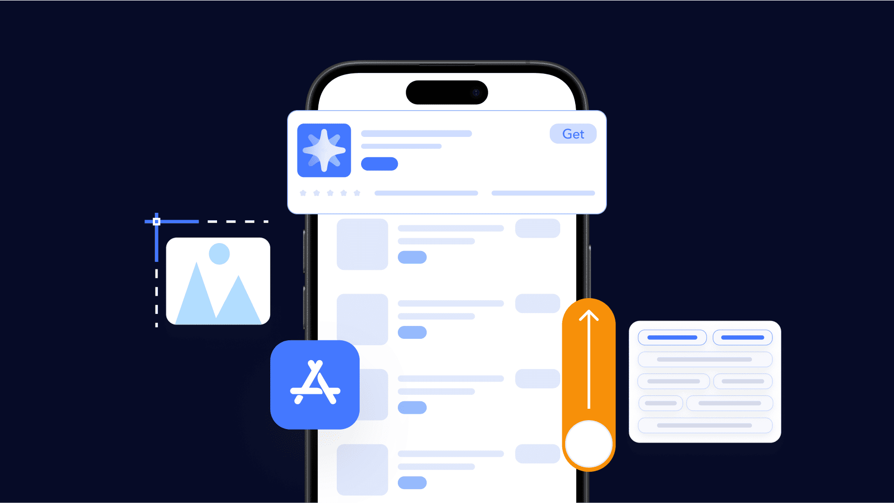
This handbook will serve as your roadmap, packed with emerging trends, valuable insights, and the best ASO tools & resources. It aims to help you stay ahead of the competition and enhance your app marketing strategy for substantial growth in 2025 and beyond.
Open the App Store and scroll for a moment.
Your eyes naturally jump to some icons and ignore others. Your brain instantly filters based on shapes, colors, and familiarity. In that moment, your app icon acts as a pre-filtering signal.
And today, this signal matters more than ever. Both Apple and Google confirm that your app icon is shown in multiple key places, like the App Store / Play Store listings, Home Screen, system UI, and search results on their platforms.
That’s why your app icon needs to be designed intentionally, not just aesthetically.
What is an app icon?
In 2026, an app icon is a cross-platform trust and recognition signal that both people and the stores understand instantly.
Because the icon appears across discovery feeds, Home/Launcher screens, widgets, and notifications, it’s one of your most-seen, behavior-tracked visuals and a major lever on taps and installs.
Important distinction: an app icon is not the same thing as your app logo. It can be inspired by your logo, but it cannot carry tiny text, thin lines, or visual noise.
Also, the shape is not controlled by you.
- On iOS, you submit a square icon, and the system automatically applies rounded corners and, starting in iOS 26, a Liquid Glass design. This effect gives the icon a smooth, glass-like appearance with subtle reflections and depth.
- On Android, you upload two layers: a foreground and a background. The system then applies an adaptive mask that adjusts the icon’s shape according to the device’s theme.
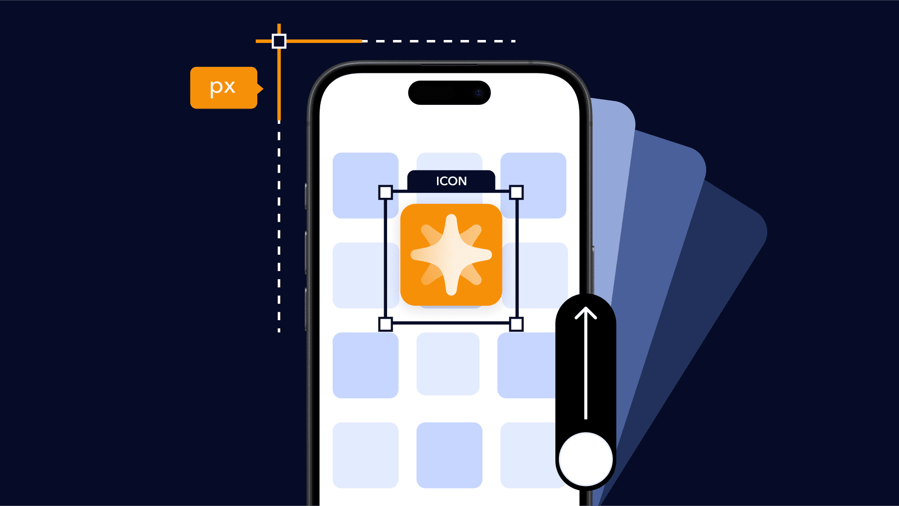
App icon sizes at a glance (iOS & Android – 2026)
Below are the exact app icon sizes you need for iOS and Android in 2026. If you just need the dimensions, this table is all you need.
| Platform | Use case | Required size |
| iOS (App Store) | App Store icon (master) | 1024 × 1024 px |
| Android (Google Play) | Store listing icon | 512 × 512 px |
| Android (Launcher) | Adaptive icon (foreground) | 108 × 108 dp |
| Android (Launcher) | Adaptive icon (background) | 108 × 108 dp |
Apple App Store app icon sizes (iOS, iPadOS, macOS, watchOS, tvOS)
When it comes to app icon design for iOS, understanding how icon sizes work is still important, but the process is much easier now.
Apple no longer expects you to export every pixel size manually. Instead, you create one 1024×1024 layered master icon, and the system handles the rest. iOS and iPadOS automatically generate all the smaller runtime sizes from that master, like 180×180, 152×152, 167×167, and 120×120.
These sizes below are still used throughout the system, but you don’t have to export them one by one. The runtime takes care of it, as long as your app icon design follows the latest layered format.
iOS and iPadOS app icon sizes
| @2x (pixels) | @3x (pixels) iPhone only | Usage |
| 120×120 | 180×180 | Home Screen on iPhone |
| 167×167 | – | Home Screen on iPad Pro |
| 152×152 | – | Home Screen on iPad, iPad mini |
| 80×80 | 120×120 | Spotlight on iPhone, iPad Pro, iPad, iPad mini |
| 58×58 | 87×87 | Settings on iPhone, iPad Pro, iPad, iPad mini |
| 76×76 | 114×114 | Notifications on iPhone, iPad Pro, iPad, iPad mini |
macOS app icon sizes
| @1x (pixels) | @2x (pixels) |
| 512×512 | 1024×1024 |
| 256×256 | 512×512 |
| 128×128 | 256×256 |
| 32×32 | 64×64 |
| 16×16 | 32×32 |
tvOS app icon sizes
| @1x (pixels) | @2x (pixels) | Usage |
| 400×240 | 800×480 | Home Screen |
watchOS app icon sizes
| 38mm | 40mm | 41mm | 42mm | 44mm | 45mm | 49mm | Usage |
| 80×80 | 88×88 | 92×92 | 80×80 | 100×100 | 102×102 | 108×108 | Home Screen |
| 48×48 | 55×55 | 58×58 | 55×55 | 58×58 | 66×66 | 66×66 | Notification Center |
| 172×172 | 196×196 | 196×196 | 196×196 | 216×216 | 234×234 | 258×258 | Short Look |
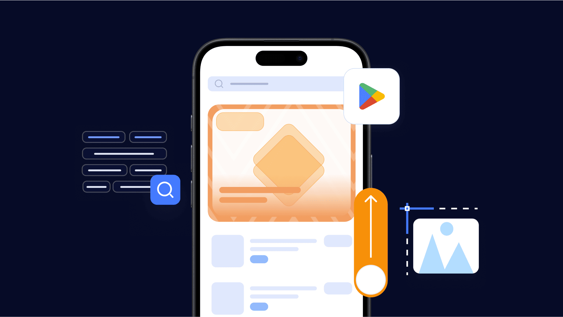
Google Play Store app icon sizes (2026)
Icon artwork on Google Play Store has the option to fill the entire asset space, or you can arrange and place design elements like logos using the keyline grid. When positioning your artwork, consider keylines as a guide rather than a strict rule.
When crafting your artwork, make sure it adheres to the following:
Store listing icon (static)
-
Final size: 512 × 512 px
-
Format: 32-bit PNG
-
Color space: sRGB
-
Max file size: 1024 KB
-
Shape: Full square
-
Corner radius: Applied dynamically by Google (≈20%)
-
Shadow: Do not add your own
Google Play automatically applies masking and shadows, so your artwork must be clean and flat.
How to place your artwork (pick one)
- Full-bleed. Art fills the whole square. Best for illustrations/photos. Keep shapes big and simple.
- Keyline grid. Logo sits inside guides. Best for clean logos/symbols. Use the grid to center and balance, don’t cram.
Where will users see it? Your icon appears on your store listing, search results, and top charts, so clarity at small sizes matters.
Android launcher icons size & safe area
Easy mistakes that get icons flagged on Android (avoid all of these)
- Adding marketing text like “#1”, “SALE”, “FREE”
- Baking in your own rounded corners or outer shadows
- Showing badges that imply Google Play endorsement (e.g., program logos)
- Using graphics that mislead users about what your app does
These break Play’s icon rules/metadata policy and can block publication.

Why app icons are important?
App icons appear across more system surfaces, adapt to dynamic visual effects from the OS, and can be A/B tested directly in the stores.
So, let’s take a broader look at why app icons are so important today:
1. Icons show up in more places than any other asset.
This small visual asset now represents your app across many different contexts.
On iOS and iPadOS, Apple’s guidelines note that your app icon is used in key locations throughout the system, including the Home Screen, system Settings, search results, and the App Store listing.
On Android, Google’s adaptive-icon guidelines show that your icon is used by the launcher, shortcuts, the Settings app, share dialogs, and the overview (recent apps) screen, and it applies across all device form-factors (phone, wearables, and others). Your listing on Google Play also uses your app icon as the public-facing artwork.
This is why your app icon needs to be extremely clear and instantly recognizable, because it’s the first impression everywhere.
2. The OS now applies its own visual effects – so your icon must survive system styling
Starting in 2025, both platforms apply extra visual treatment on top of your uploaded artwork.
On iOS 26, the new Liquid Glass design treats your icon like layered glass. It adds depth, reflections, and light effects. If your shapes are not clear and bold, these effects can merge everything and make the icon look flat.
On Android 15, adaptive icons are also more dynamic. The system masks the shape, applies Material You color themes, and even adds parallax when you swipe.
Because both platforms apply styling in real time, the icons that perform best are the ones built with:
- clean silhouettes
- strong contrast
- clear separation between foreground and background
If these three are strong, system effects will enhance your icon.
If not, the system will expose every weakness.
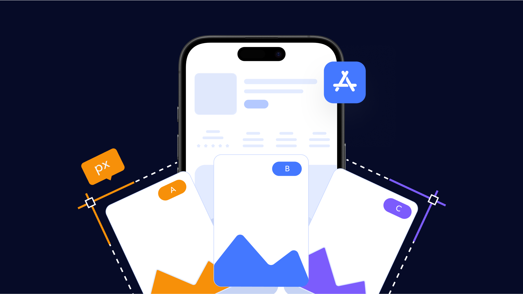
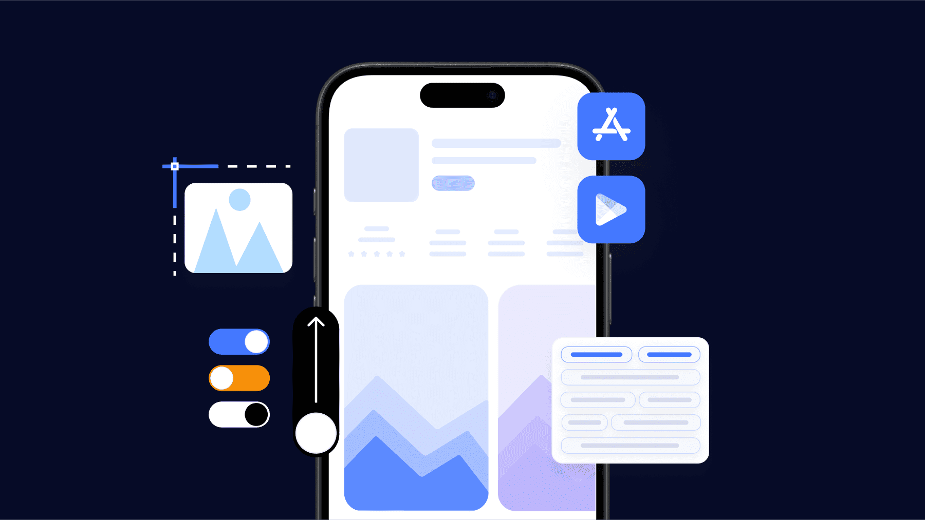
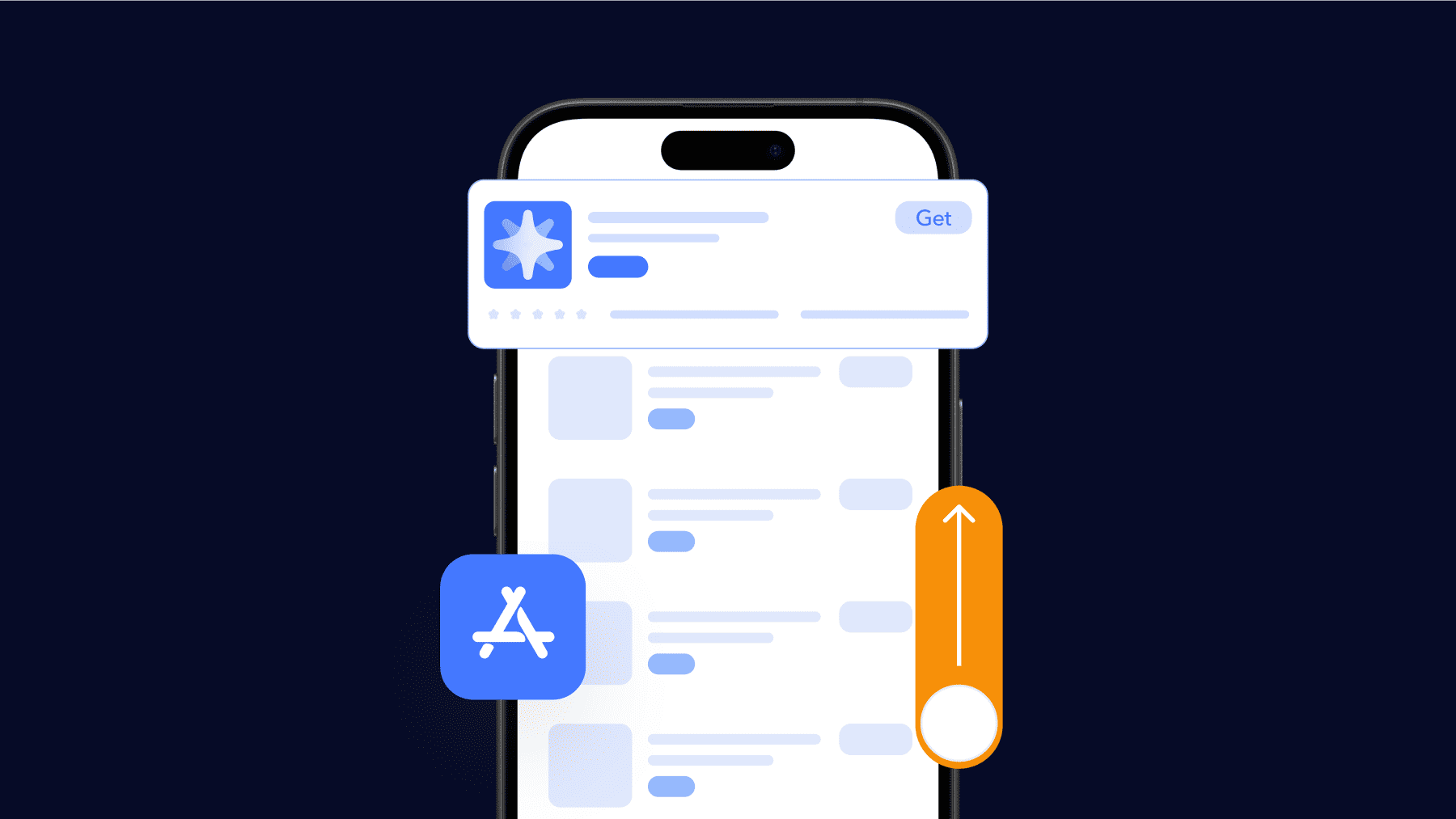
3. You can now A/B test your app icon
Both Apple and Google now let you test multiple app icon versions directly in their stores.
On iOS, App Store product page optimization allows you to test up to three different icons simultaneously. Once a winner is clear, you can apply it to all users with a single click.
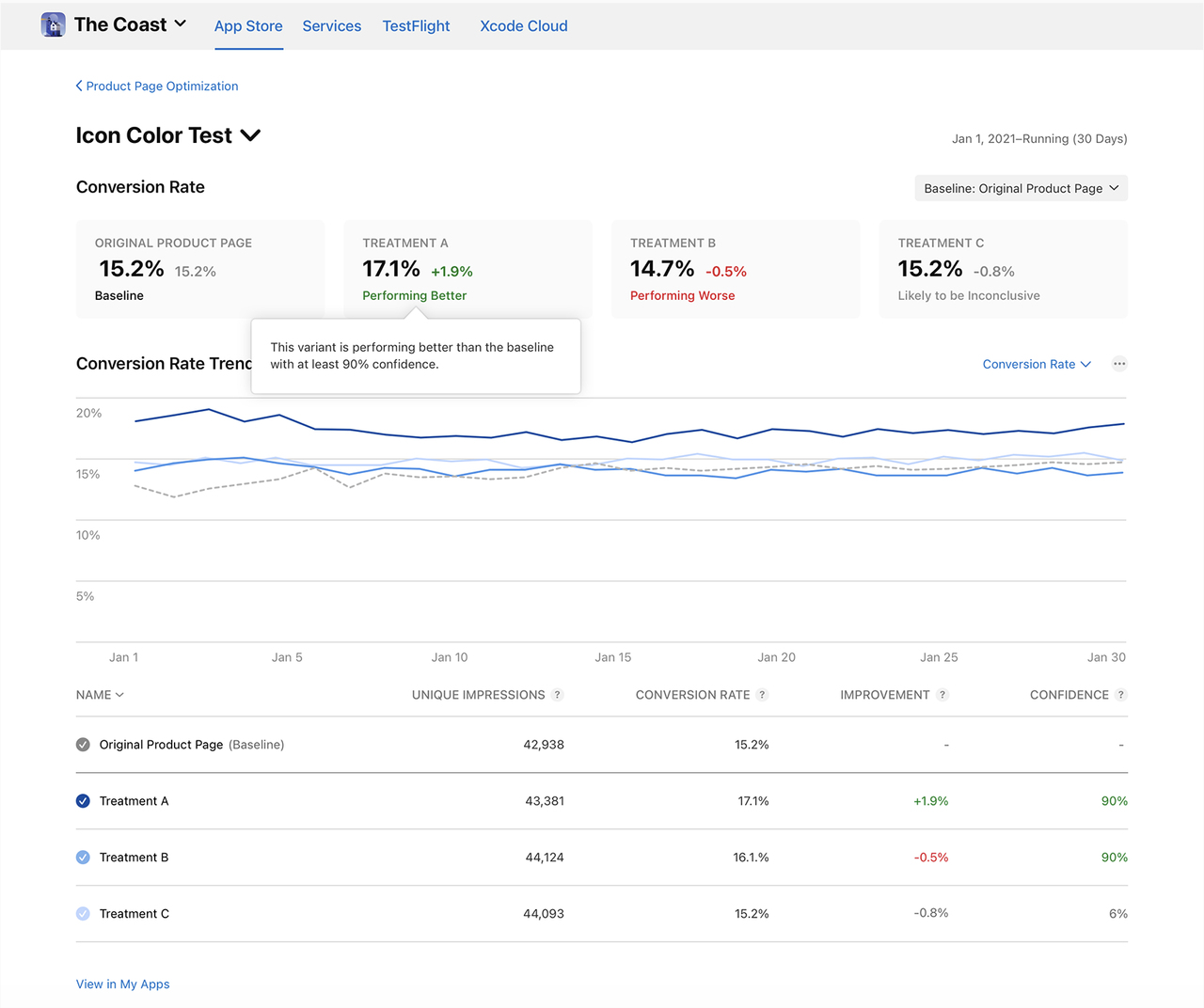
On Android, Google Play’s store listing experiments let you test different icons (and other assets) live and measure which version drives more installs.
This means your icon design choices are measurable.
You get real data on tap-through rates (TTR) and conversion rates (CVR), and the best-performing icon becomes one of your most cost-effective ways to boost app downloads, without changing your product or paying for ads.
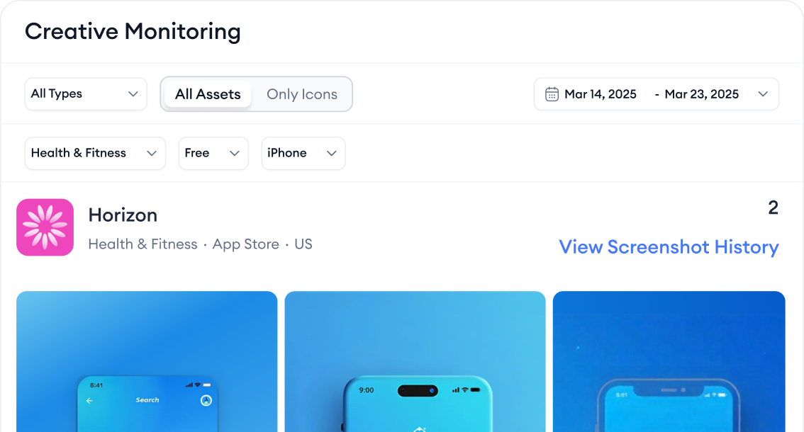
And here’s where MobileAction helps you operate even smarter:
With Creative Monitoring, you can see when your competitors change their icons, what theme they’re testing, and when those changes happen. This context helps you not waste time on “random redesigns.” You design and test based on what actually moves the market in your category.
Essential elements of app icon design
In 2025, both platforms treat the icon as a small but highly scanned visual signal. The OS applies dynamic styling on top (Liquid Glass on Apple, dynamic masking + Material You on Android). So your design must hold up under system styling.
The core principles:
1. One clear idea
Ask yourself: “Can a user describe this icon in three words?”
Your icon should communicate one thing.
People don’t read icons. They recognize them in under a second.
If you put too many mini-ideas inside the icon (multiple small symbols, too many visual hints), the brain has to “solve” the image, and users skip it.
So your job is to remove everything that is not essential.
Small example (calculator)
- Good: one bold “+” symbol → fast to understand
- Bad: tiny keypad + tiny numbers + sparkles → too many ideas competing
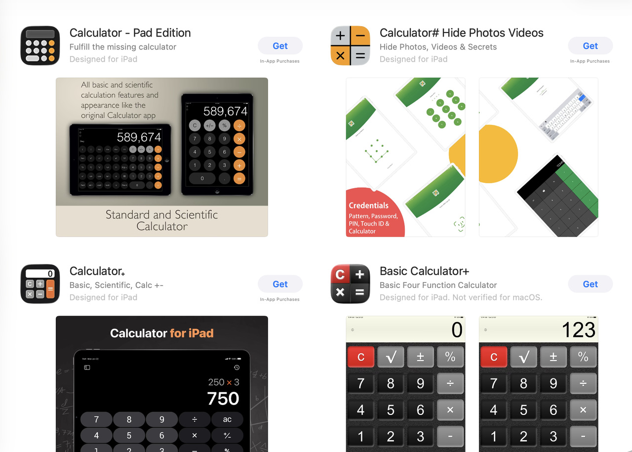
Your icon is not a mini-illustration.
It’s a micro-signal that needs to be understood instantly.
2. Clear layer separation (foreground vs background)
Ask yourself: “If the system changes how the icon looks, is my subject still obvious?”
In 2025, both iOS and Android automatically apply visual effects to your app icon. These effects can change how your design looks, even if you didn’t add anything extra.
- iOS 26 now wraps every icon in Liquid Glass design.
- Android 15 masks the icon into many shapes and automatically tints the background with the user’s system color.
Because of this, your icon will always be “styled” by the OS.
So, if your foreground (main symbol) and background (base color/shape) don’t have clear separation, these effects can blend everything together and make your icon look muddy or blurry.
Make it simple:
- Foreground (subject): the main symbol that communicates what the app is about.
- Background: the surface that supports that symbol and makes it readable.
The subject carries meaning.
The background only exists to make that meaning clearer.
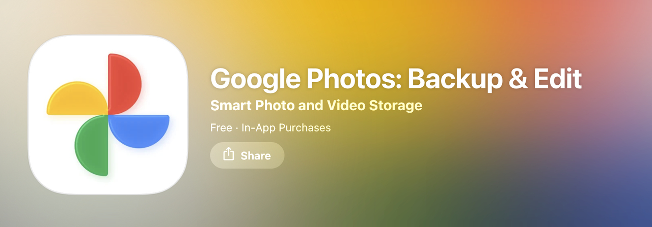
Google Photos is a perfect example of clear layer separation. You have 4 strong colored shapes (red, yellow, green, blue) sitting clearly on a neutral white background. Even when iOS or Android add their own styling on top, the subject stays obvious and readable instantly.
3. Limited color palette with strong contrast
Ask yourself: “If this icon sat on a busy wallpaper, would it still be visible?”
Your icon is not viewed in a perfect white Figma frame. It is viewed:
- in dark mode
- in light mode
- on messy wallpapers
- in widgets
- in search suggestions (tiny and on tinted surfaces)
If your color contrast is weak, your icon blends into whatever is behind it. When an icon blends → the brain cannot detect it → you lose recognition.
Use high contrast between the main shape and the background so the silhouette stays readable everywhere.
4. Simple shapes, bold forms
Ask yourself: “Is the main symbol staying in the safe centre area?”
You do not control the corner shape of your icon. On both iOS and Android, you upload a square. Then the system applies the corner radius for you.
- On iOS, the OS applies the rounding + the Liquid Glass material. (so your corner edges always look like Apple’s style, not yours)
- On Android, the OS masks the icon into the device’s current shape. (some devices are more rounded, some are squarer)
So the real shape that users see is not exactly what you upload.
This is why you should never push important visual elements too close to the edges. Those areas are “danger zones” because the OS might trim or distort them.
This is the practical rule: Keep your meaningful shapes inside a safe zone (a slightly smaller inner box). Let the corners breathe.
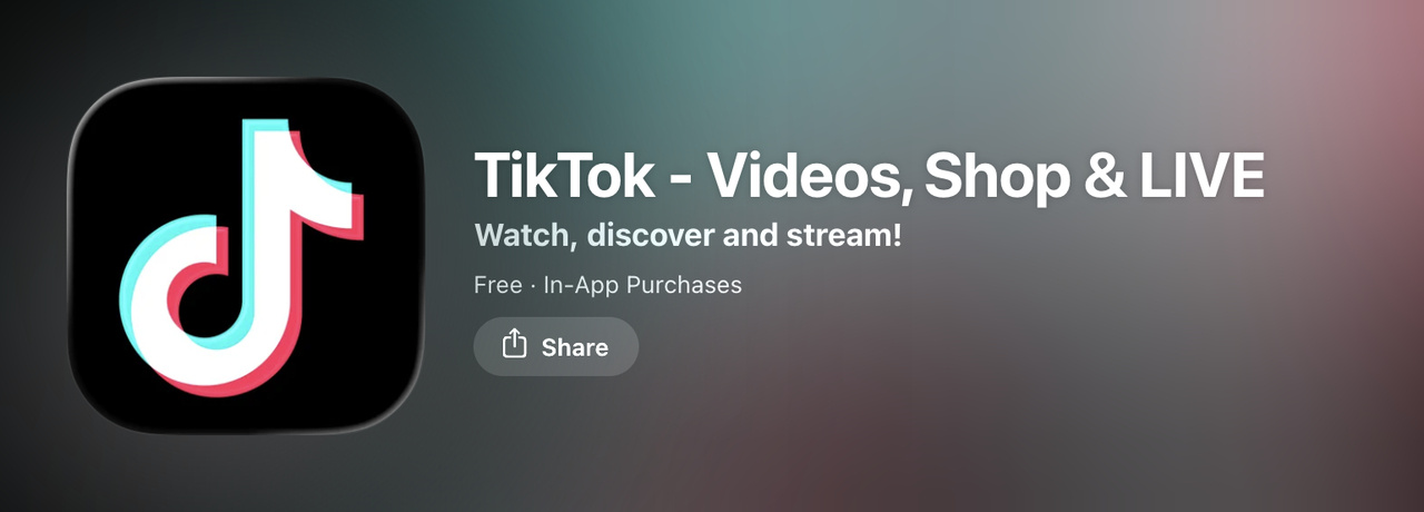
TikTok places its neon music note in the centre. There is nothing important touching the corners. So even if the OS rounds the shape more or less, the main symbol stays clear, strong, and readable.
5. Readable at all sizes
Ask yourself: “Is my main shape still visible at tiny sizes?”
Realistically, your icon will not always be shown at the App Store size.
- On iOS, notification icons can drop to 20pt (≈60px @3x).
- On Android, small icon surfaces use around 24dp.
So the icon must remain readable even when it shrinks to those system-driven minimums. If your shape collapses at those scales, the icon is too detailed.
Rule is, your main subject must still be recognizable when previewed around these system-level smallest sizes:
- ~60px for iOS
- ~24dp area for Android
If not, simplify it.
How to design an app icon for iOS and Android
Follow these steps in order:
Step 1: Know what each platform wants
iOS (Apple):
- You upload a square icon, and the system adds rounded corners and a glass-like effect.
- You need to create your icon using a tool called Icon Composer (Apple provides it for free).
Android:
- You’ll make an adaptive icon with two parts: the main image (foreground) and a background.
- Android automatically shapes the icon depending on the device (circle, square, teardrop, etc.).
- For newer Android versions (13+), you also add a monochrome version (1-color version for themed icons).
Google Play Store icon (for your store listing):
- Needs to be 512×512 px, PNG, under 1 MB, and with no shadows or corners added (Google adds those for you).
This means your icon must look clear even when the system changes how it looks. So you need one clear symbol in the center and a clean background.
Step 2: Sketch one clear idea
Ask yourself: “What does my app help people do?” and, turn that into one simple shape. Do not add small text or tiny details. On phones, your icon will also show up in very small sizes (like notifications).
A weather app can use a simple cloud with a small sun, not tiny raindrops, lightning, and temperature numbers.
Step 3: Design the icon artwork
Use any tool you like (Figma, Sketch, Illustrator) to create your icon artwork, but keep these in mind:
- Use bold, simple shapes that stand out.
- Make sure there is a clear difference between the foreground (your symbol) and the background.
- Use 2–3 main colors max, and make sure they contrast well (so it’s readable on dark and light backgrounds).
- Keep your main shape in the center and away from the edges (iOS and Android might crop it).
Step 4: Check how it looks in real life
Test your icon before you upload it:
- Place it on different wallpapers (light, dark, colorful).
- Shrink it down to tiny sizes (e.g., 60px or smaller).
- Does it still look clear?
- Is it still easy to recognize?
If not, go back and simplify the design more.
Step 5: Export platform-specific files
Now let’s prepare the files for each platform:
For iOS:
- Open Apple’s Icon Composer tool.
- Add your background layer and main symbol as separate layers.
- Use the built-in Liquid Glass preview to see how it will look.
- Export the icon bundle and drop it into your Xcode project.
For Android:
- Open Android Studio, go to Image Asset Studio.
- Add your foreground and background layers.
- Add a monochrome icon for users who turn on themed icons.
- Preview how it looks in different icon shapes (circle, square, etc.).
➡️ Follow Android’s adaptive icon guide
For Google Play store listing:
- Export a 512×512 px, PNG, under 1MB file.
- Don’t add corners or shadows, Google handles that.
- Don’t add text like “SALE”, “#1”, or “FREE” – these get flagged and rejected.
Step 6: A/B test the icon
Once your app is live, you can test different icon versions and see which one gets more downloads:
- On iOS, use product page optimization to test up to 3 icons.
- On Android, use store listing experiments in the Play Console to test your icons.
Choose the one that performs best, based on real user data.
Step 7: Ship and improve over time
Your first icon doesn’t have to be perfect.
- You can update it later as your app grows.
- Seasonal changes, rebrands, or product updates are all great times to refresh your icon.
- Just make sure it always follows the official rules, and keep testing what works best.

App icons best practices: design & strategy guidelines
Simplicity
Keeping your app icon design simple is one of the most important best practices. At small sizes, every extra detail adds noise and weakens recognition.
Your mobile app icon needs to communicate fast. Here’s how to simplify your app icon:
- Limit your design to 1-2 clear focus points that represent the purpose of your application.
- Avoid thin lines, small text, or busy textures that blur at small sizes.
- Keep a strong silhouette with clear foreground-background contrast.
- On iOS, icons use Liquid Glass layers, so keep layers clean and distinct.
- On Android, adaptive icons need simple, readable foregrounds and backgrounds that work across different shapes and themes.
- Use flat colors or clean shapes instead of detailed photos or gradients.
- Focus only on what’s essential, remove anything that doesn’t directly express your app’s function.
A simple icon looks sharp everywhere, from App Store listings to home screens, letting users recognize your app in a split second.
Simplicity, confidence, and casual chic, these three main principles can be seen in every Uber logo. The brand name is written in white fonts on a plain black background. As simple as it is.
Focus on core value
Your icon should communicate the core idea of your app at first sight. Users need to quickly “get” what your app does and why it matters, before they even tap.
This is even more important in 2025. iOS adds Liquid Glass layers, and Android applies adaptive masks and themed colors. If your main idea is not clear, these effects will make it even more confusing.
So you need one clear visual idea.
Think like this: What is the main benefit my app provides to users? Then turn that benefit into a simple symbol or metaphor.
You can:
- pick a single object that represents the main task
- use a familiar visual metaphor from the category
- test a few ideas and see which one users understand fastest
Your goal is not to show everything your app can do. Your goal is to show the one reason people would open it.
A strong, single idea survives across all system styles and all icon sizes.
Apple Maps explains the core feature of the application very well, which is to navigate.
And today, Apple still uses Maps as a clean example of “clear core purpose”, one single idea (navigation) communicated instantly, in a way that remains readable on Home Screen, Spotlight, widgets and Siri surfaces.
Consistency
Your icon needs to look like the same brand everywhere. If your icon style changes between versions or sizes, users get confused. In 2025 this matters even more, because iOS adds Liquid Glass effects on top of your layers, and Android changes icons through adaptive masks and themed colors, so if your brand identity is not consistent, the platforms will make those differences even more obvious. This is a key part of how to design an app icon that people remember.
How to stay consistent:
- Keep the same main colors across all sizes.
- Use the same main symbol, logo, character, or shape, don’t rotate it or redraw it randomly.
- If you use text, keep the same font and style.
- Keep the same general layout so the main element is always in the same position.
- When you scale, scale down, don’t redesign the icon from scratch for each size.
- Only simplify small details when needed for readability.
Test all versions side by side. If they don’t look like the same icon family, fix it. Consistency builds memory. It makes users recognize you instantly, even when system styling changes how the icon is displayed.
Balance visual weight
Icons must work across many screen sizes. If your main symbol is too heavy or dense, it will overwhelm small contexts. In 2025 this matters even more, because both iOS can change how contrast and brightness appear, so the icon must be balanced on its own, before the OS applies styling.
Some techniques to balance visual weight include:
- Simplify logos at small sizes by removing unnecessary details.
- Lighten very dark or bold shapes so they don’t overpower smaller canvases.
- Resize or shift the main symbol so small versions don’t feel “crowded.”
- Increase line thickness and font size proportionally as size gets smaller.
- Use empty space intentionally; don’t leave large gaps that pull attention away.
- Check hierarchy, are the most important parts still clear?
- A/B test zoom levels and preview across sizes early.
Maintaining smooth visual flow across all icon sizes prevents important details from disappearing or becoming misread. This helps the icon stay consistent and understandable everywhere.
Use meaningful colors
Color strongly affects how easily people notice and remember your app icon. The goal is to attract attention, but also stay clear and readable. iOS Liquid Glass and Android themed icons can slightly change the final look of your colors on the system, so your palette must be simple and strong.
Best practices:
- Use max 2 main colors to avoid visual noise. Test the contrast between them.
- Use your brand’s core colors, so users always recognize it’s “you.”
- Saturated colors work better for creative / entertainment apps vs more muted tones for productivity/business.
- Make sure text and symbols stand out clearly against the background at very small sizes.
- Test color-blind and grayscale modes, because some colors may blend.
A simple, intentional color palette makes your icon easier to understand and remember, and keeps it readable across all surfaces and styles the OS will apply.
The updated Gmail logo draws inspiration from the previous iteration, featuring a gradient white envelope outlined in a distinct contrast. The outline takes the shape of an enlarged and striking letter “M,” representing “Mail,” and is presented in the recognizable Google color palette of blue, red, yellow, and green.
Adhere to platform guidelines
If you want your app approved fast, you need to follow Apple and Google’s icon rules exactly. Today, this is even more important because both platforms now expect very specific asset formats. If you ignore them, your icon can easily get rejected.
What you need to know:
- On iOS, icons are layered and the system applies Liquid Glass. → You must prepare proper layered artwork.
- On Android, icons are adaptive and can also turn into themed icons. → You must give Google a separate foreground layer + background layer + (optional) monochrome.
Do not try to “fake” system effects (no custom corners, shadows, gloss). The OS adds those.
Before you upload your icon, ask yourself:
- Did I follow the latest Apple + Google asset specs?
- Did I export every required size?
- Is the symbol still readable when it gets small?
- Does the icon still look clear under Liquid Glass (iOS) and themed colors (Android)?
- Is every layer clean and named correctly?
Why and when to refresh your app icon design
While app icons play a crucial role in the initial discovery and onboarding phase, their importance doesn’t end there. Regularly rebranding and refreshing app icons is equally vital to driving engagement over the long run.
Here are a few reasons for periodic icon rebranded:
Reinforce app evolution
As your app adds new features or pivots to new use cases, your icon should evolve too. A visual update shows users that your app is actively improving and still aligned with their needs.
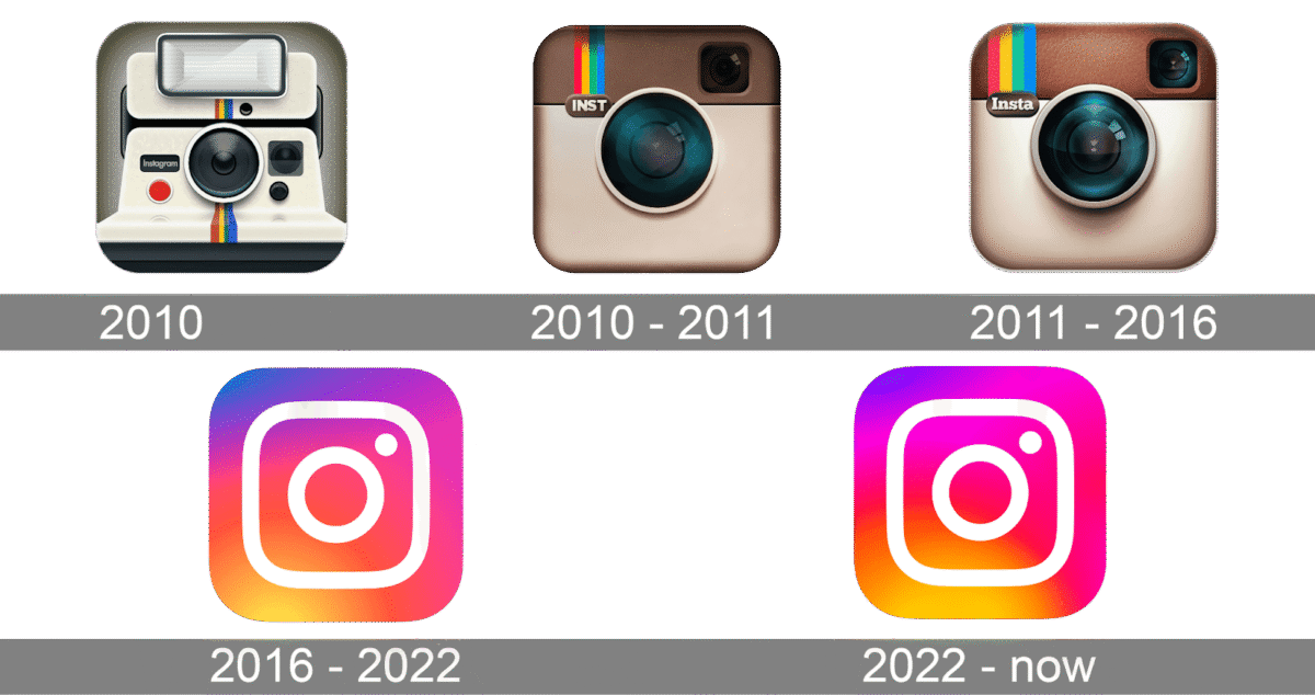
Instagram has refreshed its icon multiple times to reflect modern design trends, while still staying true to its identity as a visual-first, social sharing platform. Each update balanced freshness with recognizability, a key principle in how to design an app icon that evolves without losing its soul.
Remind existing users
New icon designs trigger updates that surface your app in front of familiar users again. It serves as a subtle reminder that the app still exists, encouraging repeat visits.
Reach new segments
Refreshed icon assets paired with acquisition campaigns can help the app stand out amongst ever-growing numbers of competing choices to discoverability.

Uber originally launched as “UberCab,” with branding that leaned into luxury. As the service expanded globally and became more inclusive, it transitioned to a minimal, universal icon that reflected simplicity, accessibility, and scale, a smart move in both product and app icon design.
Avoid visual fatigue
Users swipe past dozens of icons every day. If your app icon hasn’t changed in years, it can fade into the background. A refresh keeps things exciting and helps your app look current in today’s design landscape, making icon clarity even more important.
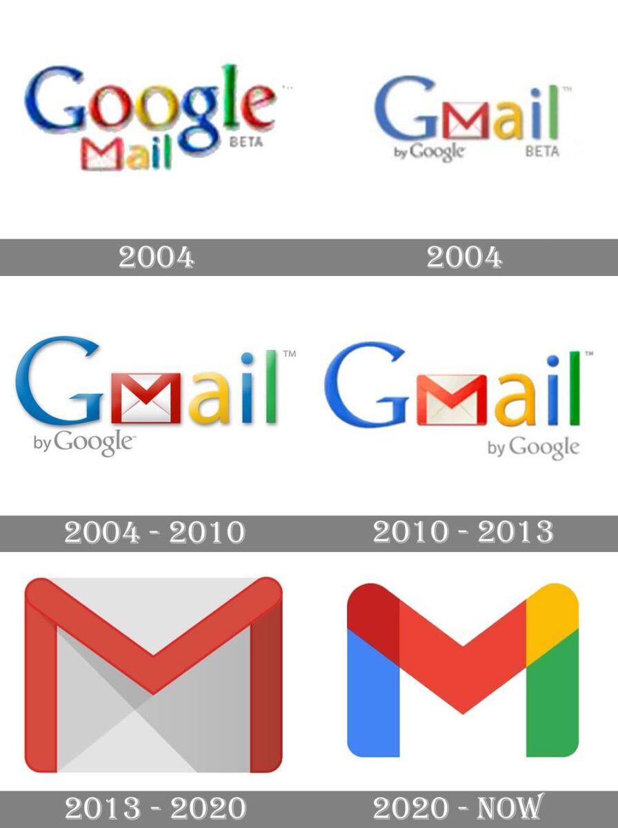
Rumor has it that Gmail’s first logo was designed the night before the product launch. The logo, which initially included an envelope icon in addition to all of Google’s doodles, became minimalist over time. The famous white and red envelope has been substituted with a stylized letter “M,” symbolizing “Mail,” rendered in the official Google color scheme, which includes blue, red, yellow, and green.
Complement other marketing
Coordinating app icon rebrands with periodic new website designs, social graphics or seasonal campaigns bolsters overall brand visibility.
Adjust targeting as needed
App icon design trends shift over time. Your original icon may no longer reflect how your target users think, feel, or interact with your category. Rebranding helps reposition your app visually to stay relevant and competitive.
By staying fresh yet consistent through scheduled icon redesigns that reinforce your brand, you can continuously motivate both existing and new users alike over the long term with your evolving mobile experience.
Conclusion
This app icon guide covered the full process, from platform requirements to creative strategy. By following the steps and best practices we outlined, you’ll design an icon that does more than just look polished. It will help users recognize your brand, understand your app’s purpose, and feel confident tapping in.
Whether you’re starting from scratch or updating an existing product, a well-designed mobile app icon is one of the simplest ways to improve visibility, conversions, and brand trust, all without touching your core product.
If you’ve been wondering how to design an app icon that people actually notice and remember, we hope this gives you a clear path to start (and improve) with confidence.
Related reading
This handbook will serve as your roadmap, packed with emerging trends, valuable insights, and the best ASO tools & resources. It aims to help you stay ahead of the competition and enhance your app marketing strategy for substantial growth in 2025 and beyond.
Resources that you'll love

Grow your app on the App Store and Google Play Store with our solutions now